Designing the brand and product experience of a mobile loan application for both individuals and businesses
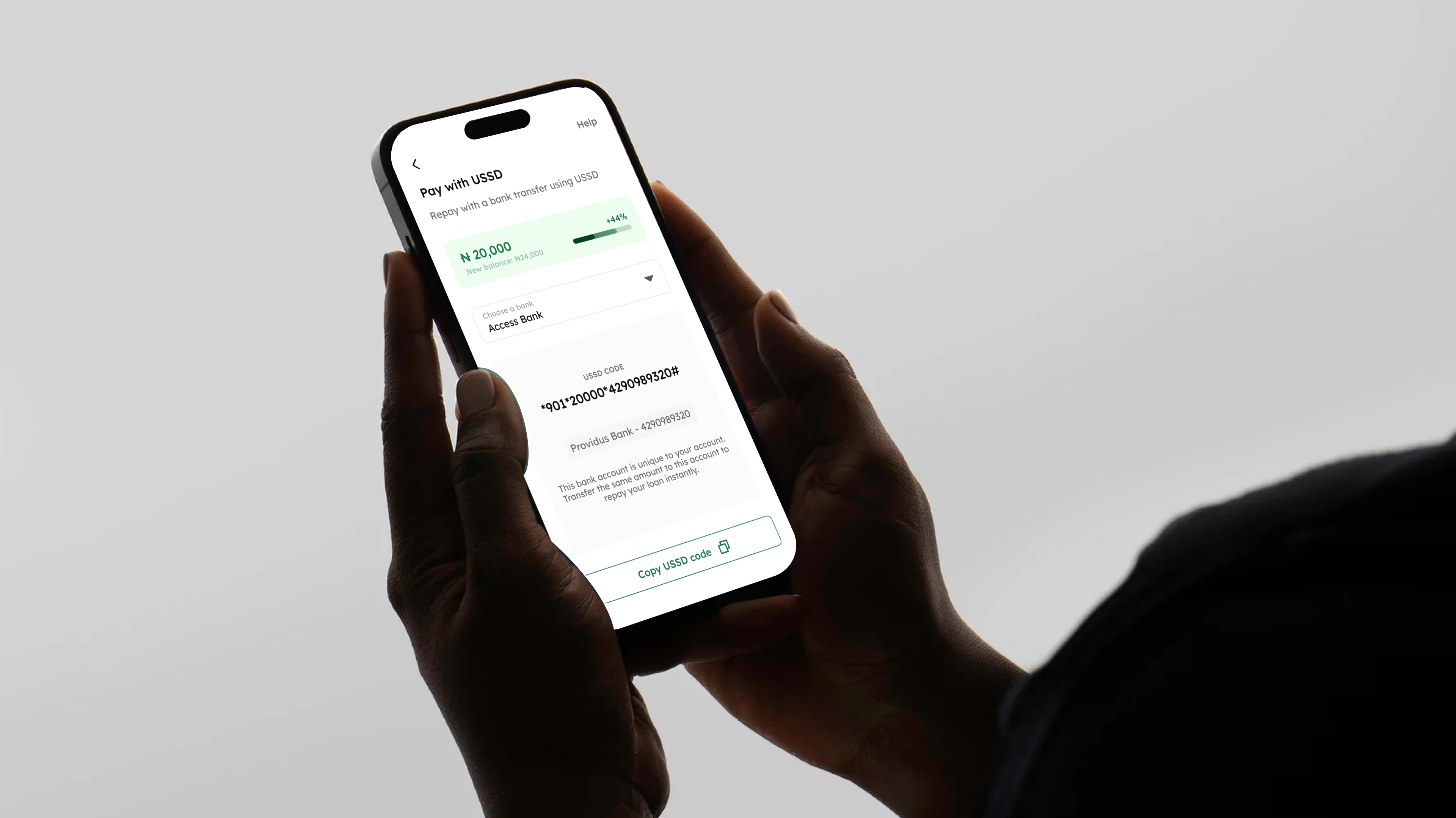
Loans are as old as banks. They are risky but come in handy a lot of the time. They help support the average business during bad months and help individuals to overcome dire situations. In today’s world, quick instant loans are the go-to as more people turn to digital solutions for their financial needs and with Accredit, we are taking a new approach to elevate the consumer lending experience.
I led the design of the brand identity and the first version of the application to be launched on mobile platforms.
- Branding
- Product Strategy
- Mobile Application Design
- Usability Testing
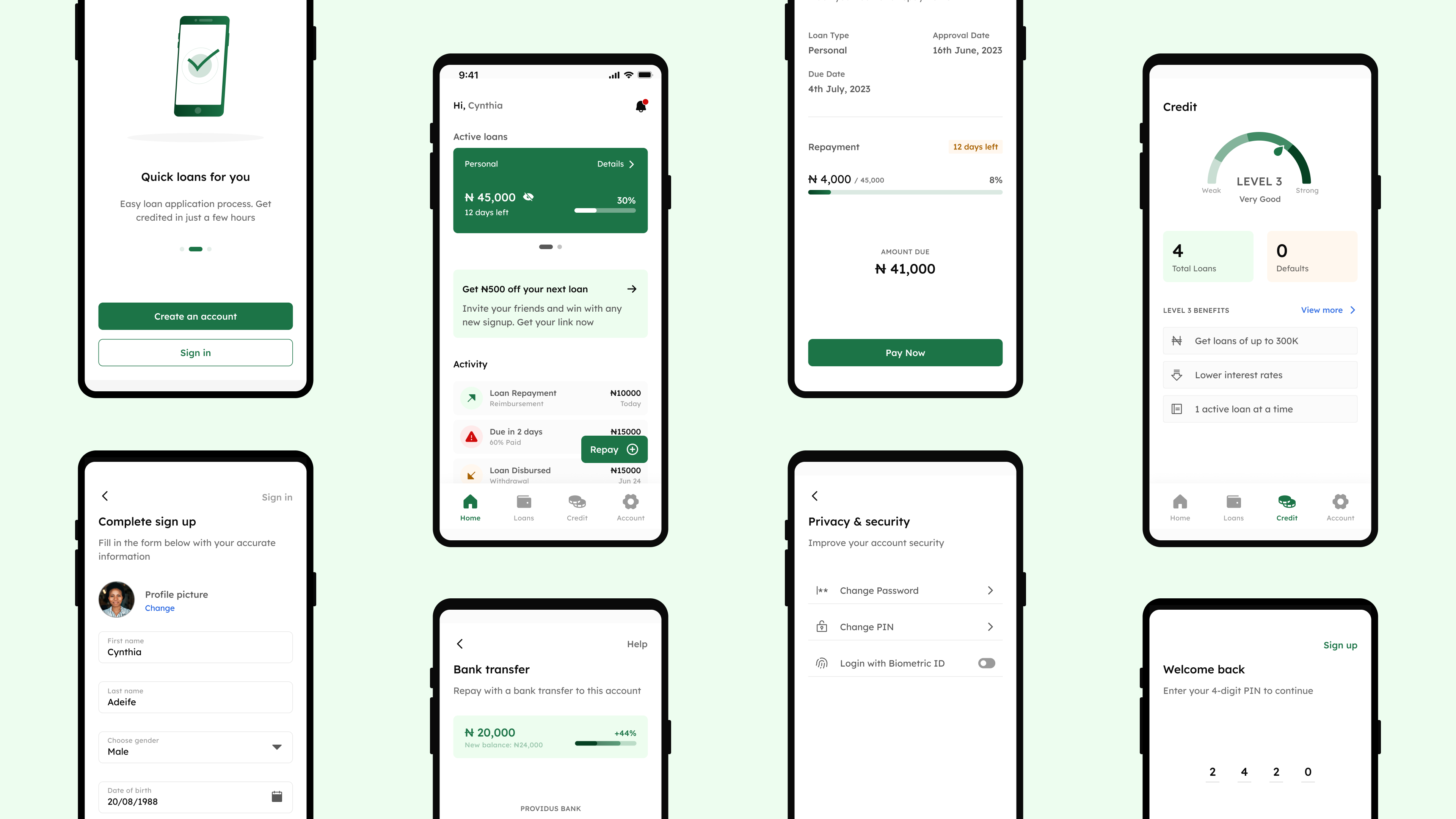
There has been a significant shift in the ease of getting loans thanks to private lenders however this of course came with its problems. Several loan apps use unethical practices, impose exorbitant interest rates and are not self serviceable.
The goal of this engagement was to refine the loan application and repayment process as well as design an identity that drives growth with trust and credibility.
Let’s start with a question..
Conversations with active borrowers and responses from participants helped validate the client’s mission. Going a step further, I read forums, articles and tweets to analyze general sentiment on loan apps. This comprehensive approach gave an in-depth understanding of the needs and frustrations of borrowers.
4
1
12
20+


To get a good grasp of the industry landscape, I began by gathering information on 4 dominant competitors and a dozen other lenders, on how they use competitive differentiation to their advantage. These include their launch dates, product offerings, as well as their customer’s feedback and unmet needs. Working together with the client on this was crucial to identify market opportunities and gaps to exploit.
Repayments
Many people cited confusion over repayment options and displeasure with aggressive tactics used by some lenders.
User Experience
Borrowers have no clue why their loan application was not approved, slow signup process with cumbersome requirements.
High Interest Rates
Borrowers are troubled by exorbitant interest rates of major lenders, often leading to debt traps and financial stress.
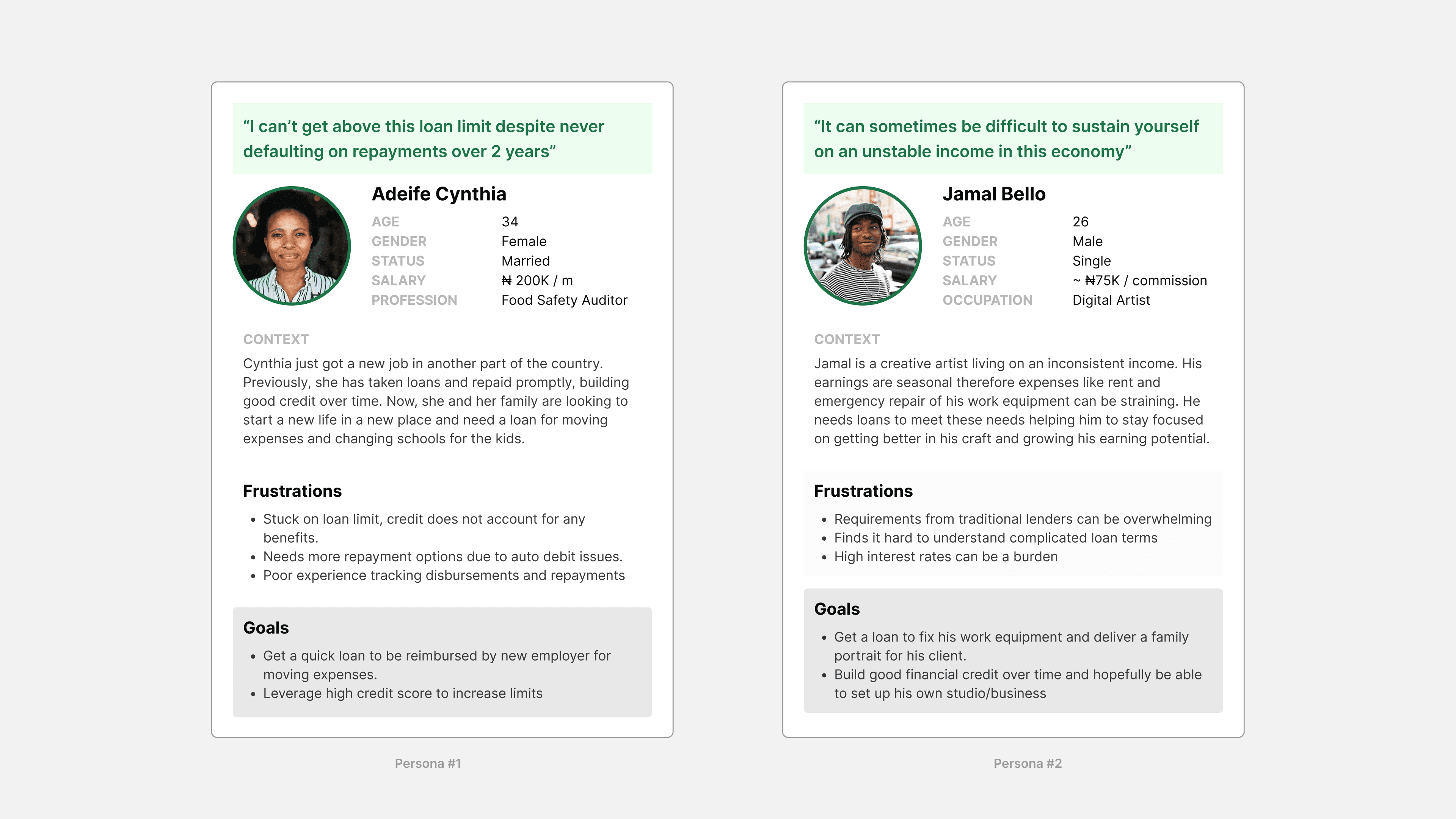
In order to empathize with users on a deeper level, I created 2 personas that represent potential users of Accredit - Cynthia as a returning borrower and Jamal as the newbie, each with their unique backgrounds and goals. This helped me to approach the next-phase of problem solving with a focus on the users and also throughout the entire design process.
- Repayments
Borrowers have options to repay loans even when offline. The app should be self serviceable to help users recover from loan default or disapproval.
- User Experience
Ingenious branding and a product with clear communication, accessible design and ease of use optimized with iterations.
- Credit System
A credit oriented approach to loan disbursement and privileges encouraging users to build financial trustworthiness.
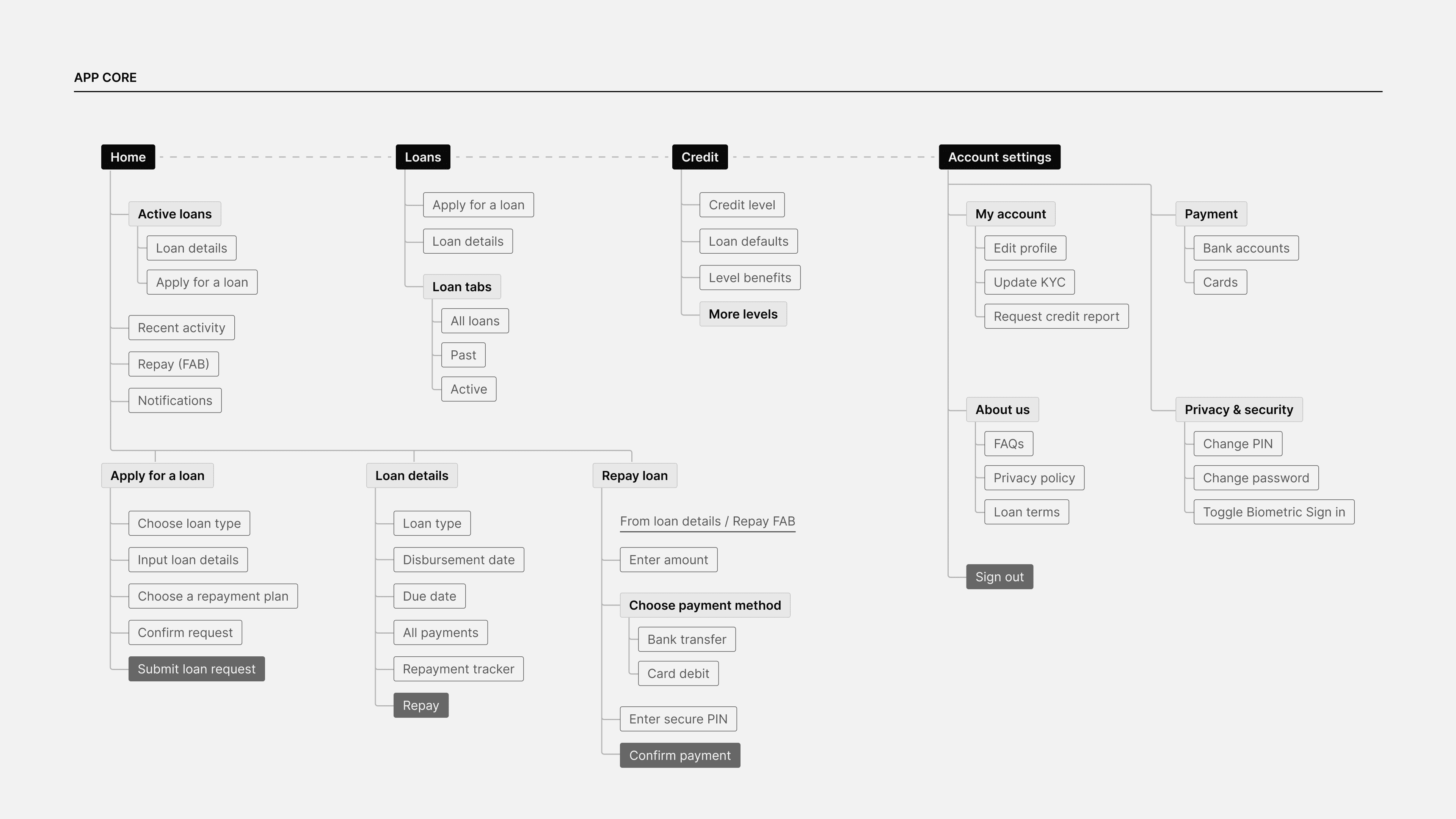
Moving forward, I outlined the end-to-end structure of the product by organizing pages, features and functionalities logically in a workflow, this ensures newbies like Jamal will be able to navigate the app seamlessly and without confusion. The result of this process was a view of the application that was not only holistic but also meticulous in detail.
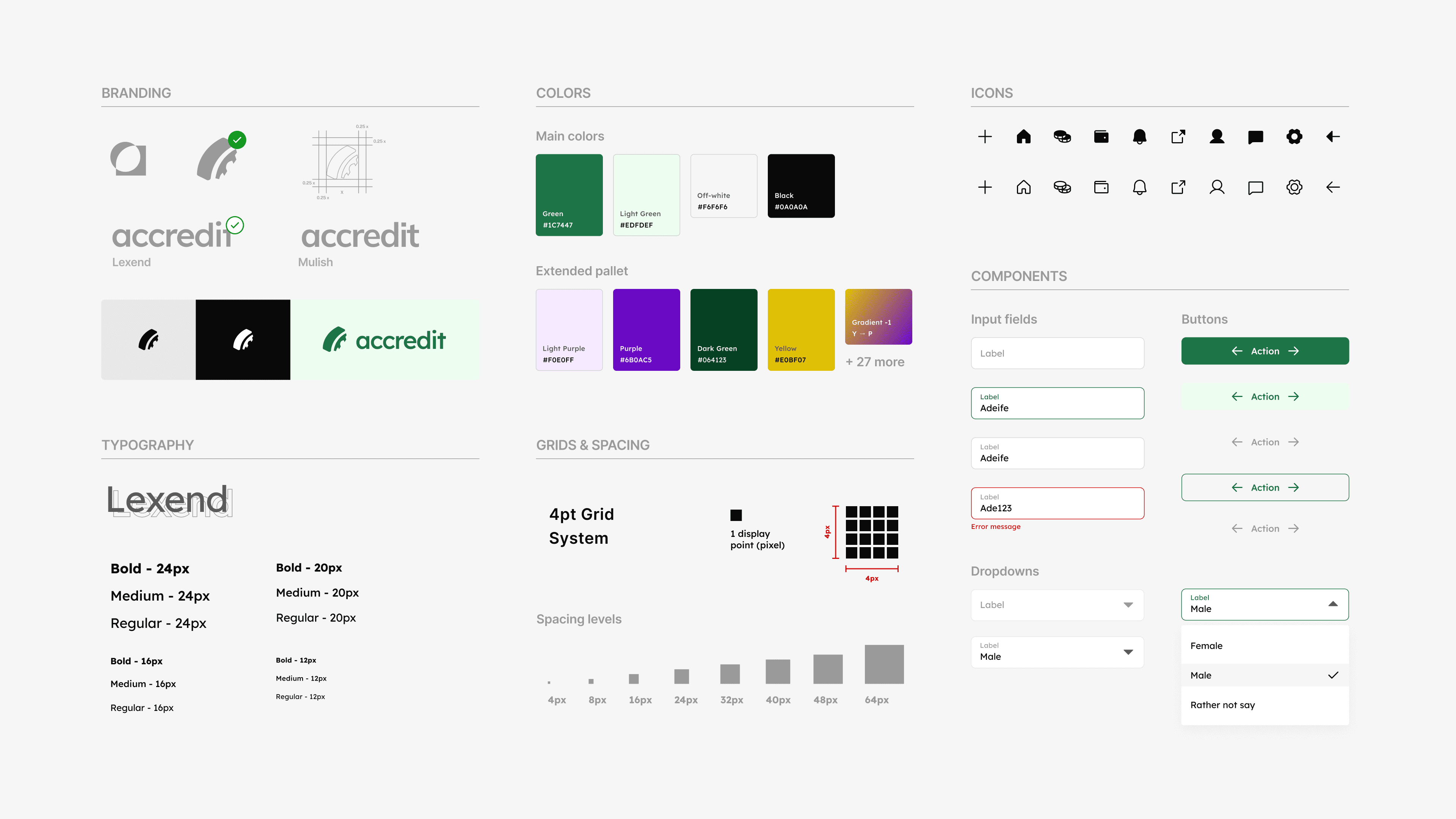
Circling back on the canvas, the goal for the brand identity was simplicity and continuity. From ideating on various logo ideas to foundational visual elements, the client made their pick. Accredit - your bridge to credit, positioned to be warm, bold and to communicate with a direct tone. For more on the brand design process, view this presentation.
To design for scalability and visual consistency, I created styles in line with mobile platform guidelines; and a library of 40+ basic reusable components, forming the building blocks of Accredit’s design system.
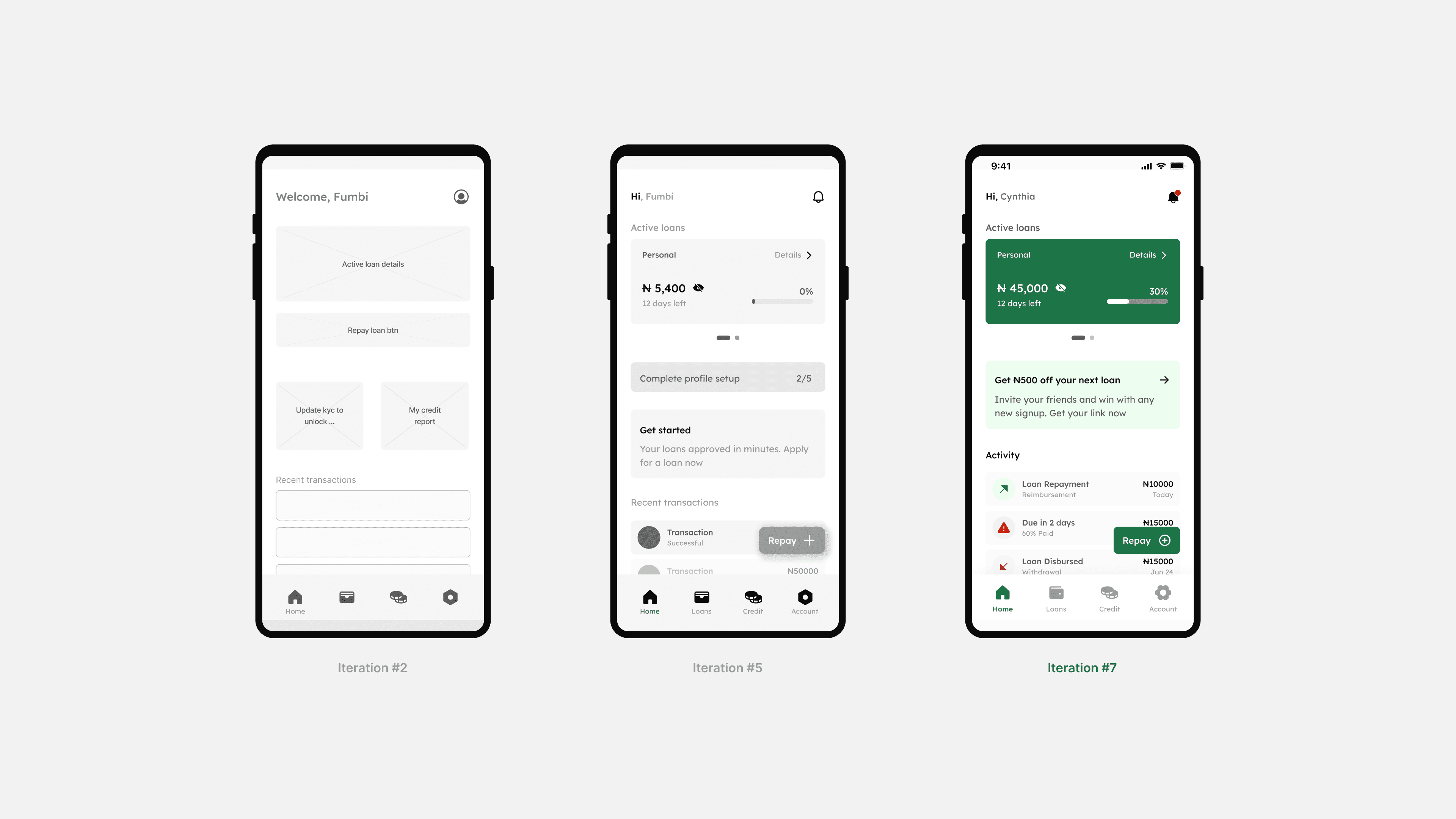
Recall, a product like this had to be easy to use, accessible and self serviceable - one way to achieve this was iterative design. For instance on the home screen layout, the thumb zone proved to be the most intuitive, informing the use of a floating action button to initiate the repayment process. This approach minimizes the number of clicks required and makes it easy for borrowers to habituate and get used to.
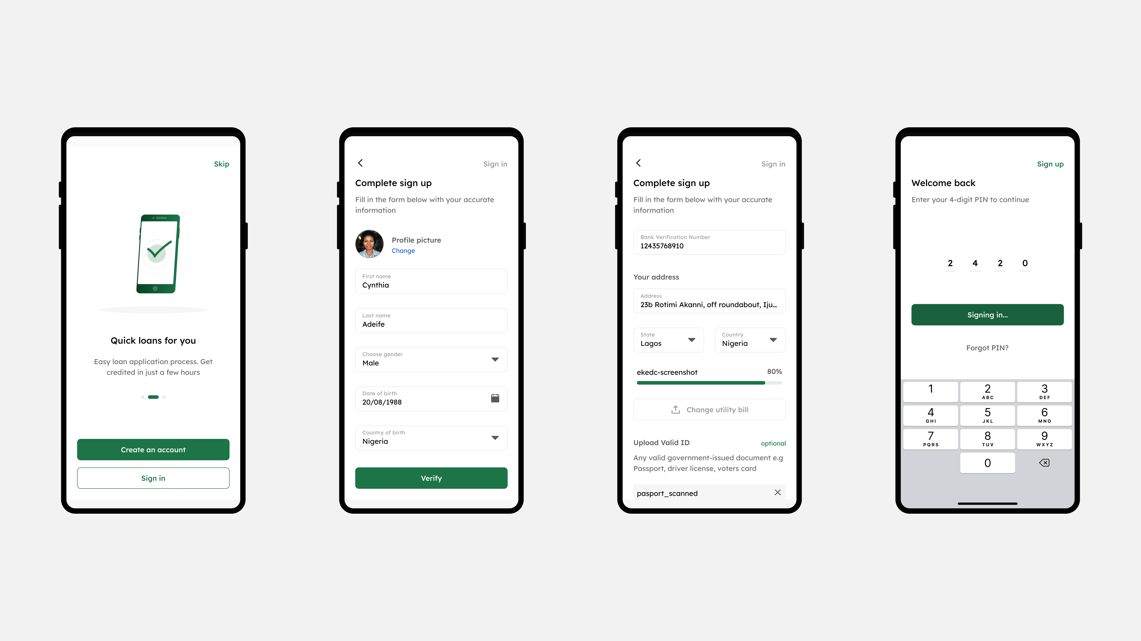
Another hurdle was to reduce drop-off and hesitation in the last step of the loan application flow. We noticed participants often read the agreement in desperation as it was a key requirement for approval. To solve this, the secure PIN was used as a universal authenticator on the app and the terms were instead linked on the page.
A resulting unmoderated testing session showed that they all completed the flow in less time and with relative ease on the updated design.
.png)
.png)
The design process embraces a human-centered approach, this means intensive research, conducting usability testing and iterating on feedback to ensure a pleasant experience every time users come on the app. This all contributed to a product with a user-friendly interface, strong visual appeal, and seamless functionality that resonates with borrowers.
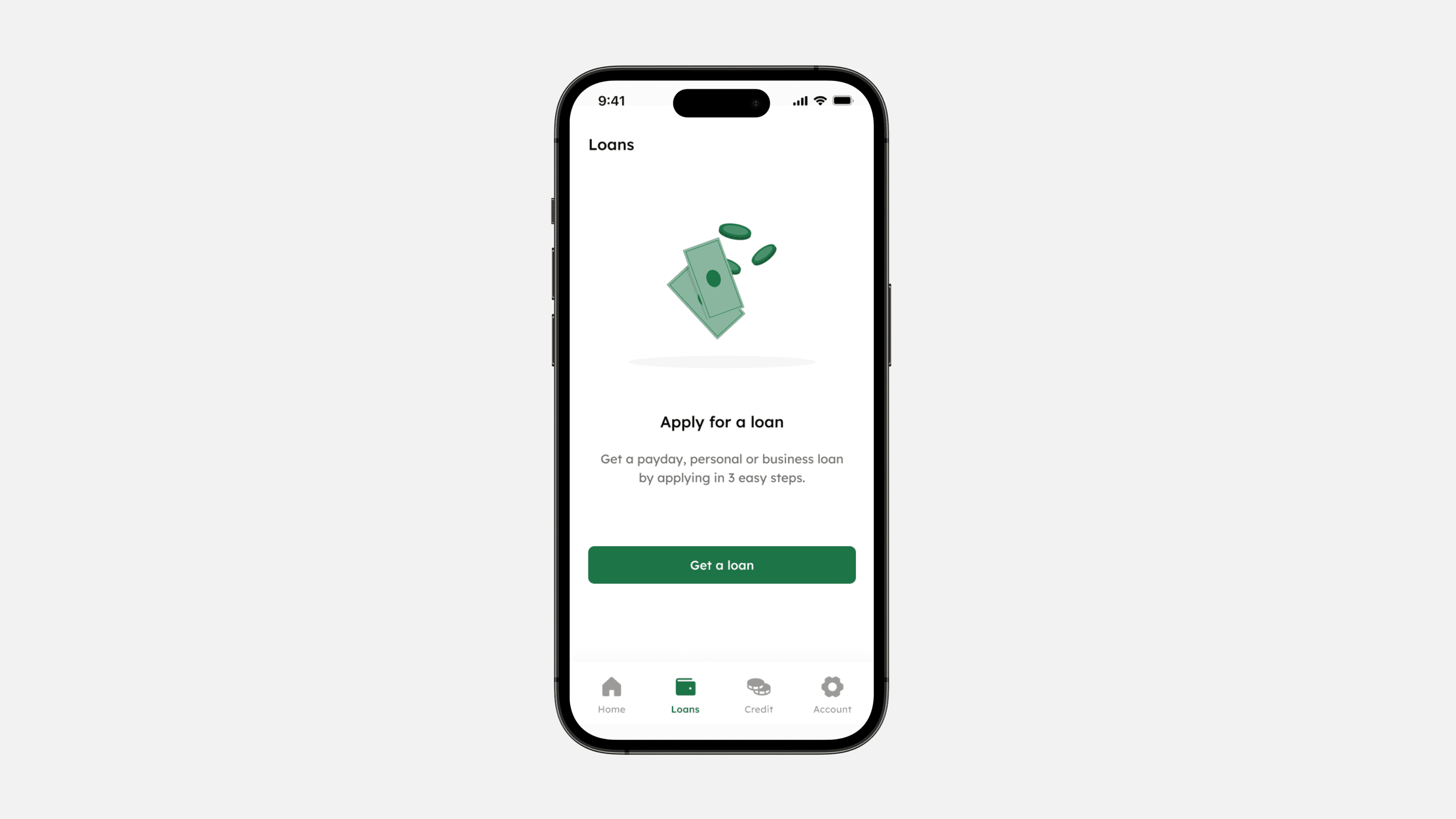
With three distinct loan types—payday, personal, and business— users have greater control over their borrowing choices. Each loan type was designed to offer clarity on its purpose, terms, and associated risks, enabling users to make informed decisions aligned with their specific needs.
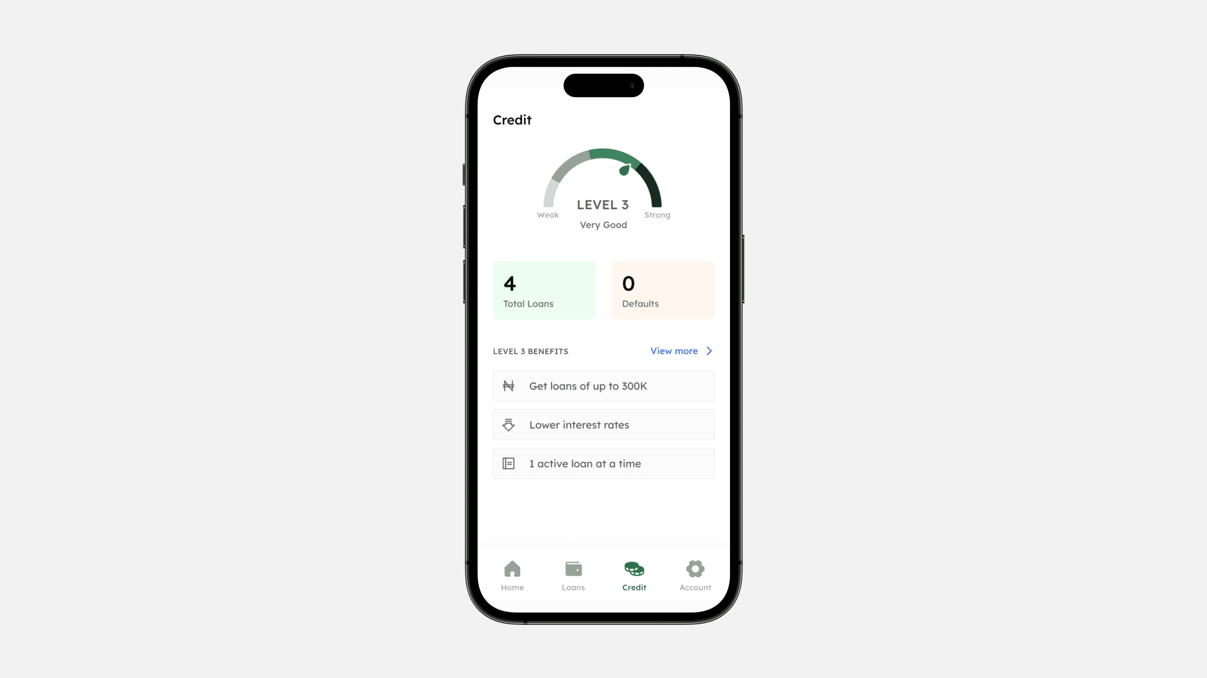
Users can boost their credit scores and unlock enhanced borrowing capabilities by fulfilling their debt repayments, fostering financial trust and rewarding responsible financial behaviour. This aligns with our mission to promote transparent and ethical lending practices.
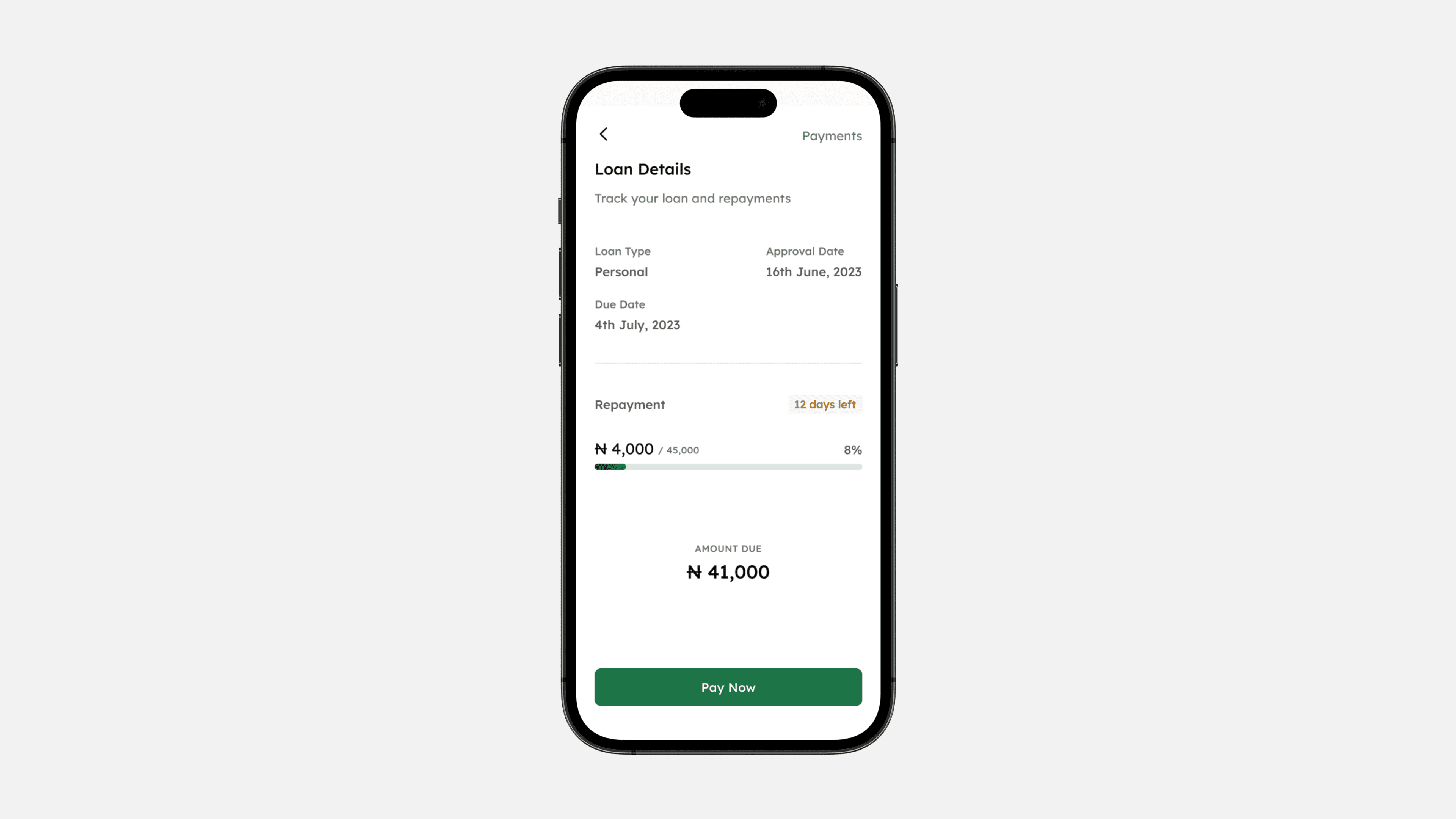
Reminders across multiple channels, including SMS, email, and in-app notifications increase the likelihood of timely repayments. Furthermore, diverse repayment methods such as USSD, bank transfers, and card auto-debit, cater to the user's individual preferences and ease the repayment process.
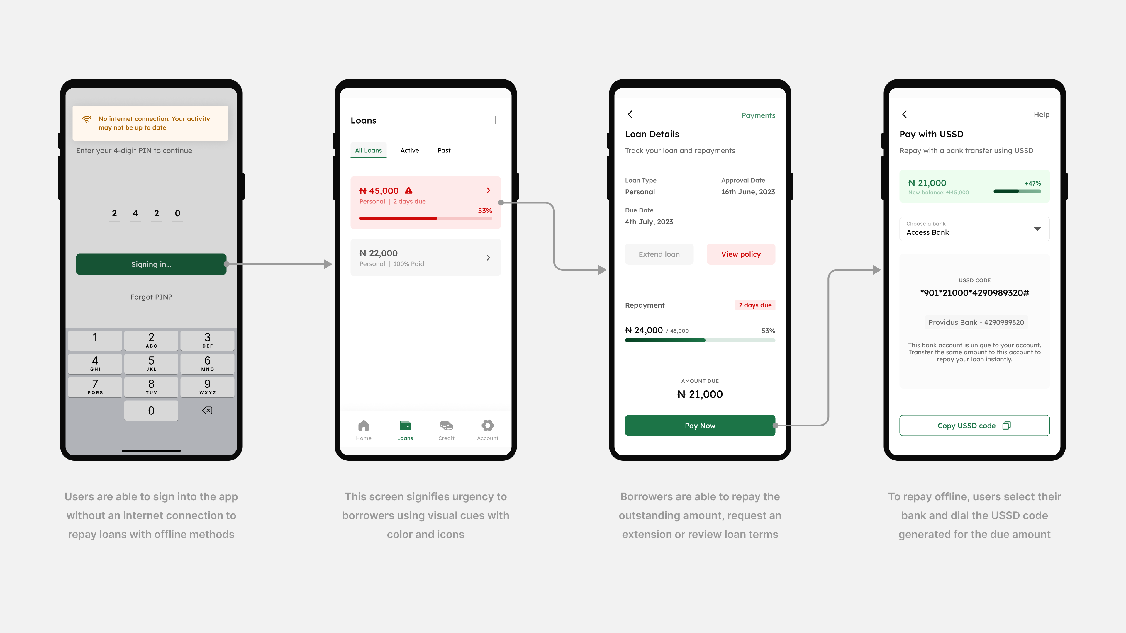
Beyond designing for ideal scenarios, it is equally important to factor in what happens when something goes wrong. In the absence of an internet connection, by including a method for offline repayment, users are certain they can fulfill their loan obligations anywhere, anytime. This transforms them into confident borrowers who view our platform as a trustworthy and supportive financial partner.
As the product evolves following go-to-market and user needs get more and more complex, a few possible next steps to consider are:
This project came with its challenges but thorough research and testing informed the design process and ensured a product that meets the users needs. The branding and design system establishes trust and recognition. Together with the user experience and focus on error handling, Accredit is set on a path for sustainable growth in the market.