Exploration of B2B Saas to automate internal processes, team schedules and redundant tasks easily
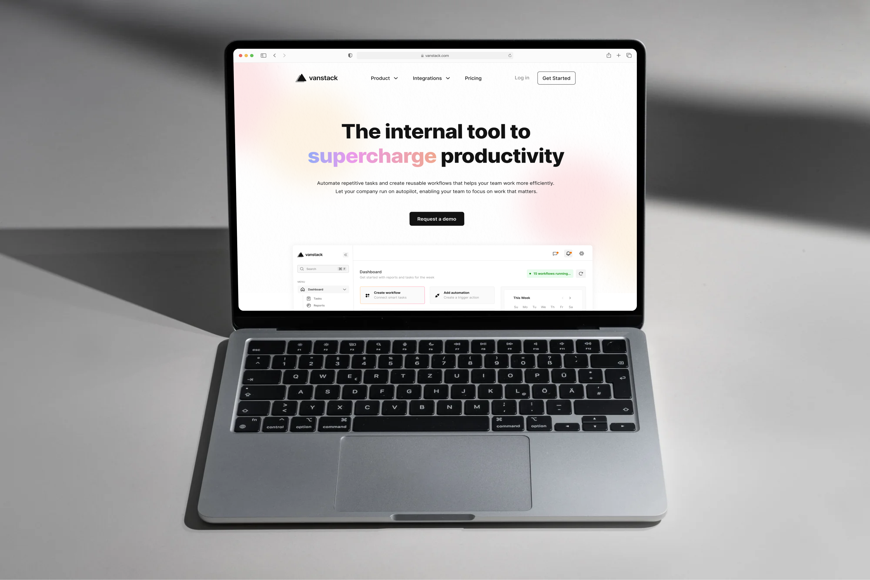
Work can be boring sometimes. Those tasks we do everyday that are repetitive or exhausting across various tools, often cause employees to feel stuck. Vanstack makes room for work that actually matters. It consolidates integrations and automates tasks in a workflow, helping your company get the easy stuff done faster. This idea sprung up while upskilling on the engineering of design systems.
This is a personal exploration project, not an actual product.
- Design Systems
- Rapid Prototyping
- Web Development
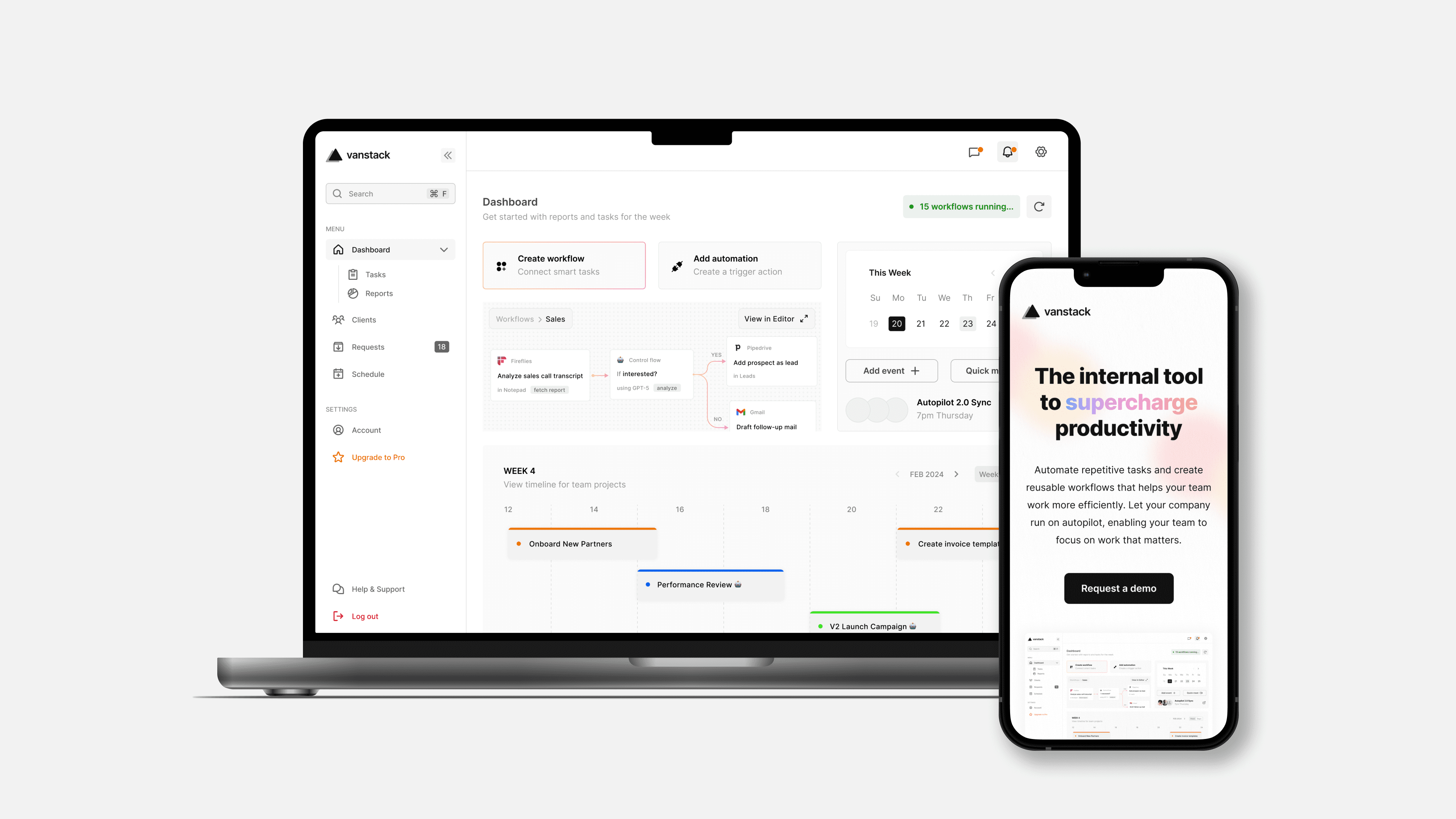
First, a business process to perform a task from start to finish is called a workflow. Take sales, for instance, which includes prospecting, lead conversion, negotiation, and product or service purchase - this workflow is often called a sales pipeline. On each workflow, desk employees use at least 8 different tools, this sums up to 4x company-wide on average.
For sales, tools for emails, meetings, transcripts, and CRMs like Pipedrive are used. Many subtasks in these workflows are repetitive for each sale - monotonous. There should be a smarter more efficient way to handle this right?

First, I looked into companies within this problem space, their product offerings and feature requests to gain valuable insight on possible solutions. Monday, Make.com and Questmate were a few notable players among others. Going a step further, I found internal tools and platforms that tackle the problem of integration to understand the standard limits for this exploration.
Extensibility
Business workflows can get complex. Automations should scale easily and without ambiguity.
Beginner Friendly
Besides pros and power users, the product must be easy to understand for non-technical individuals.
Collaboration
To avoid disrupting focus, real-time communication features could help teams work faster and better.
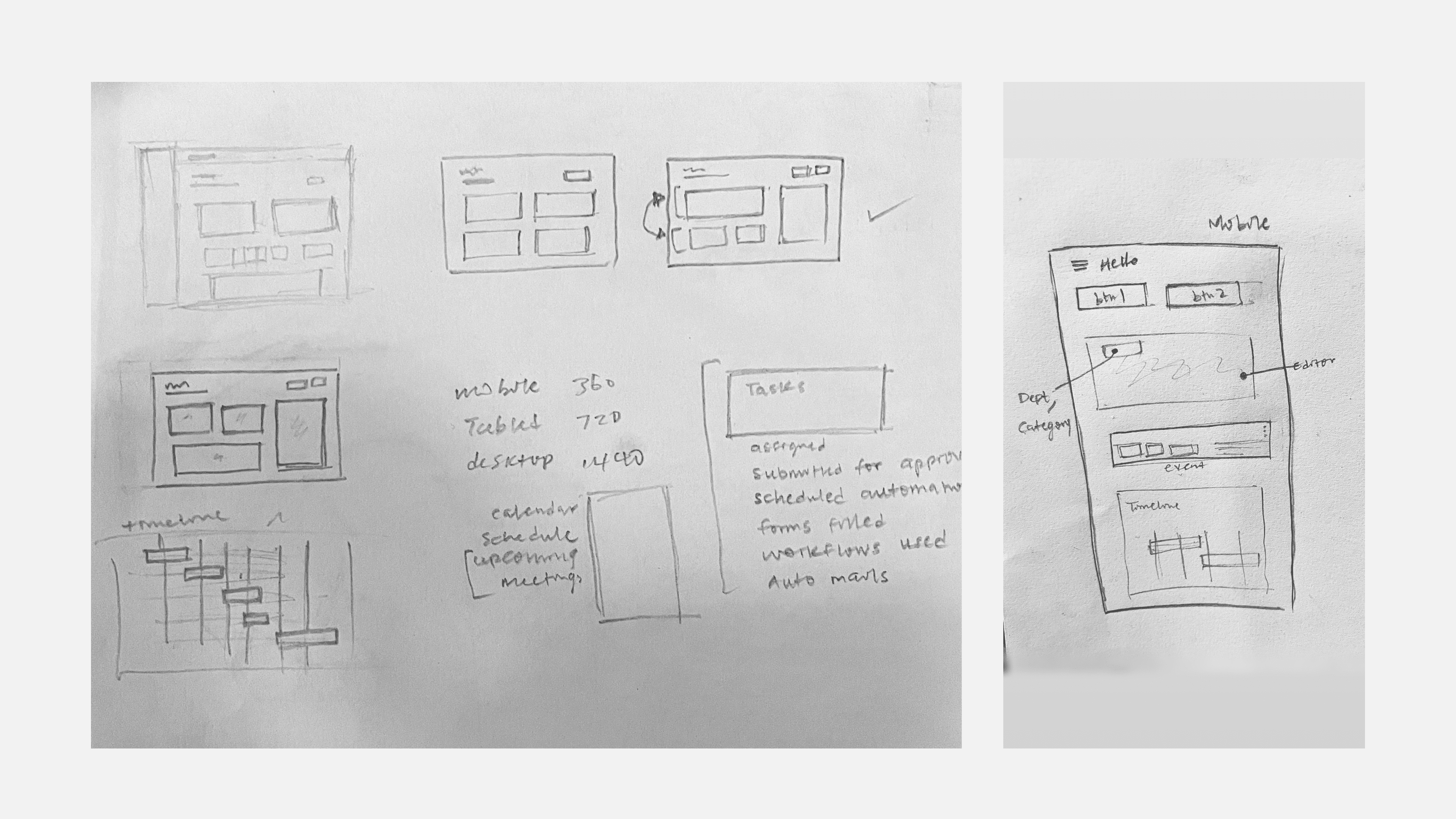
To begin the design phase, I outlined core modules and drafted a list of views for the home page. I kickstarted this process by putting pen to paper, sketching layout ideas with responsiveness in mind. Users often scan webpages in F-patterns, with the top-left usually getting the most engagement. Using this insight, primary CTA’s and the workflow editor were positioned as top priority.
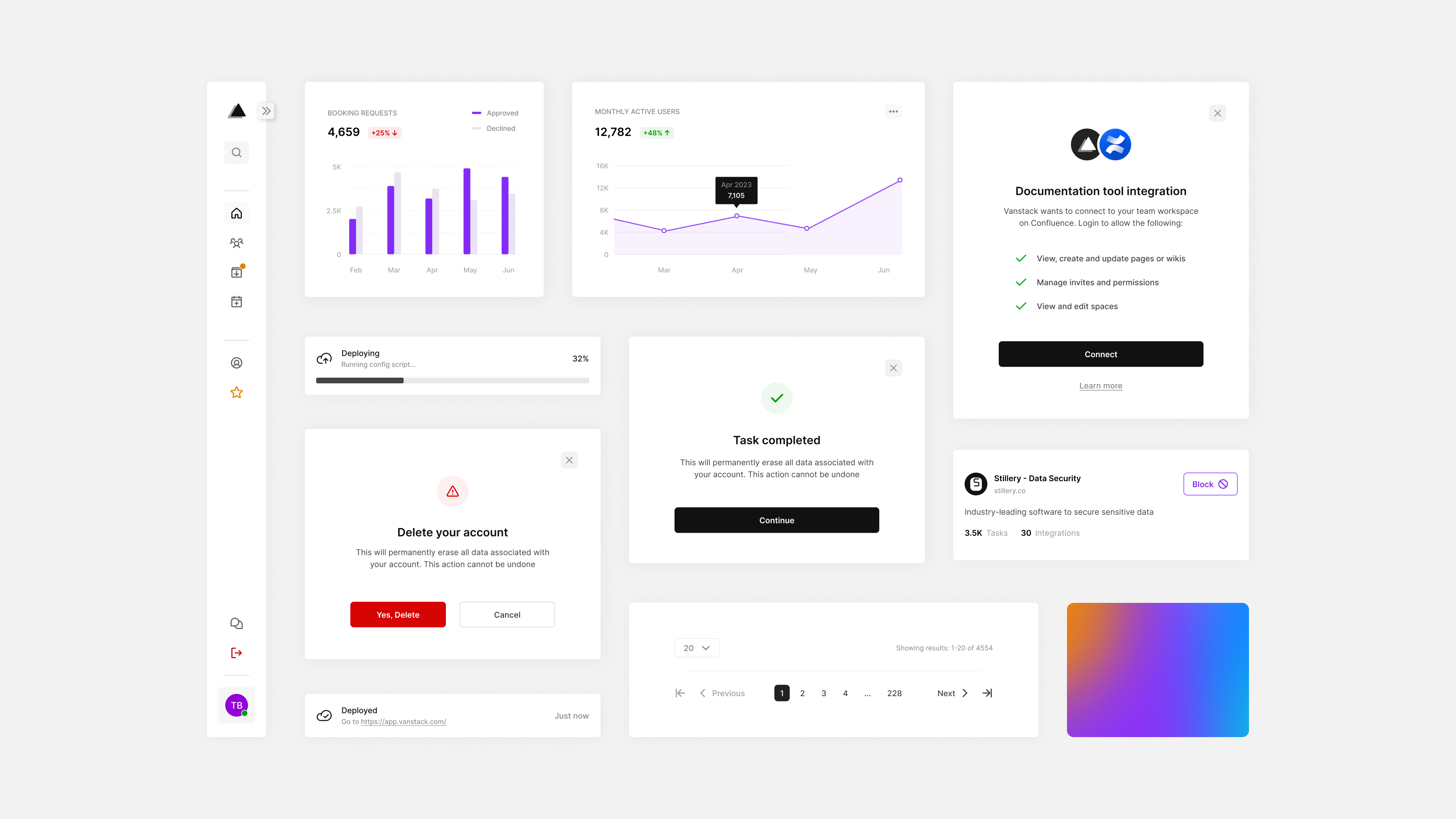
Products with a unified visual form give customers a consistent and familiar experience with every use. Starting with a style guide, I took a modular design approach to building components. Best-practices in accessibility of web content such as contrast and text-spacing were followed by design. For documentation, I noted the behaviour and states of components for development.
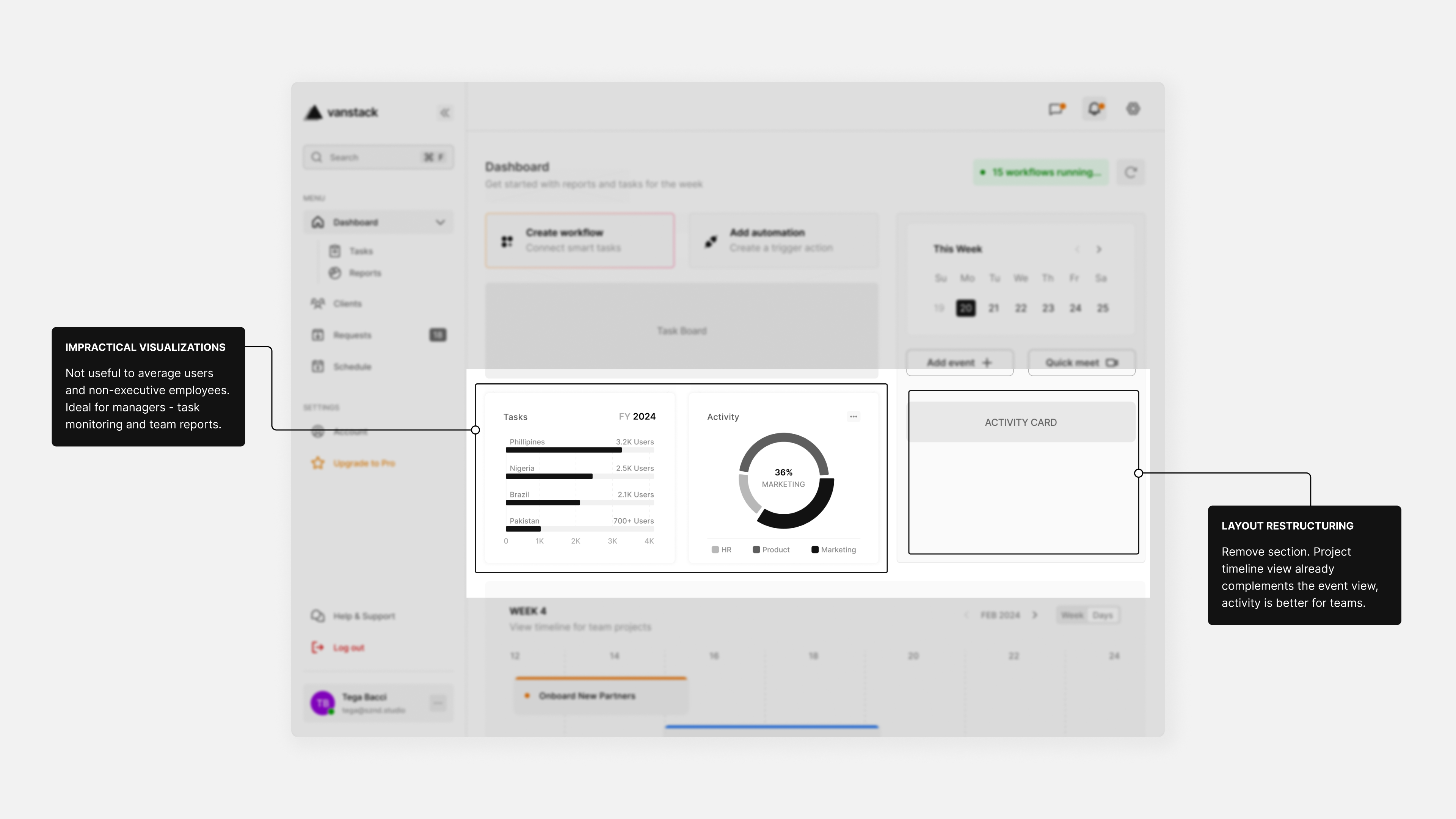
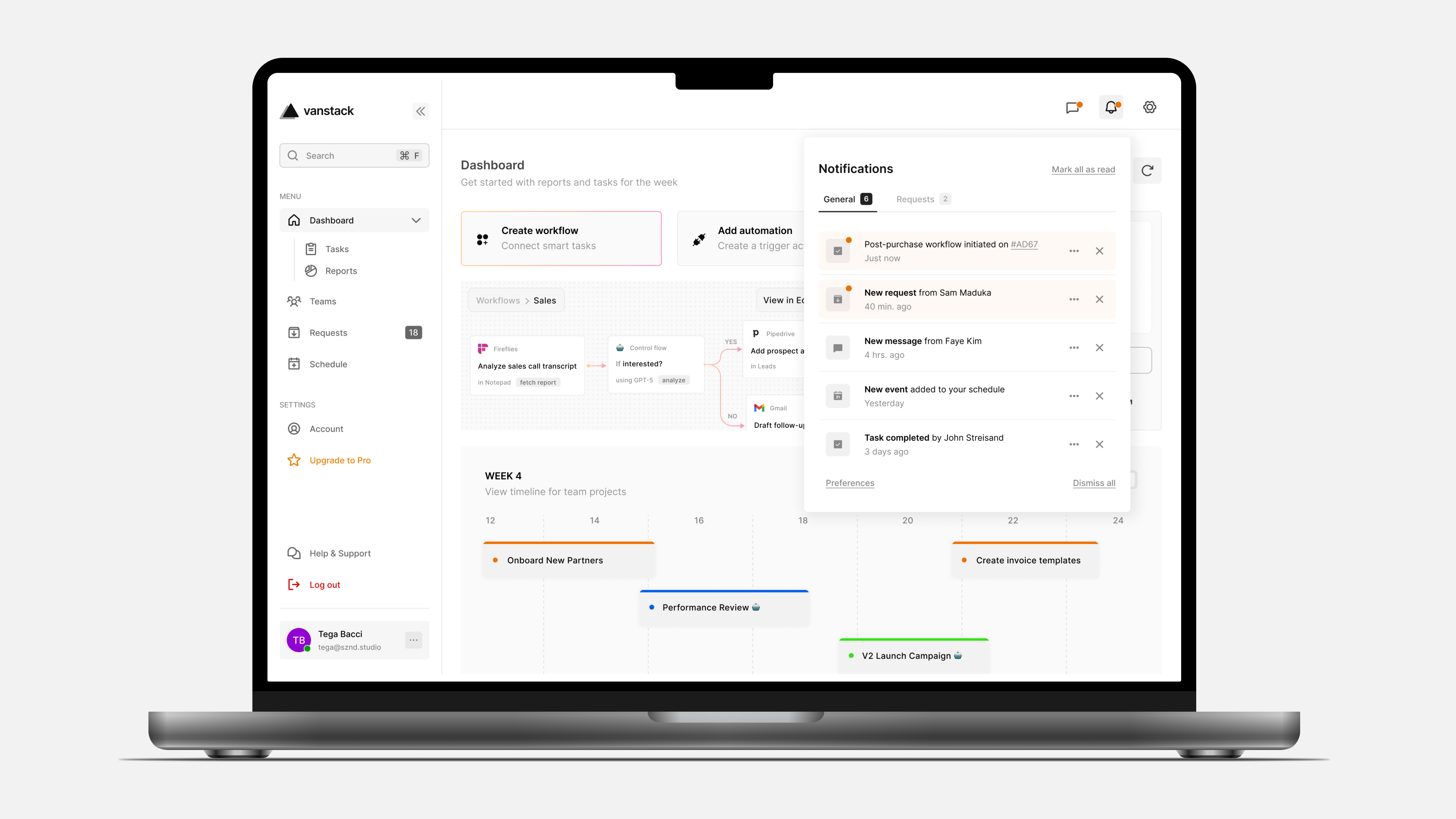
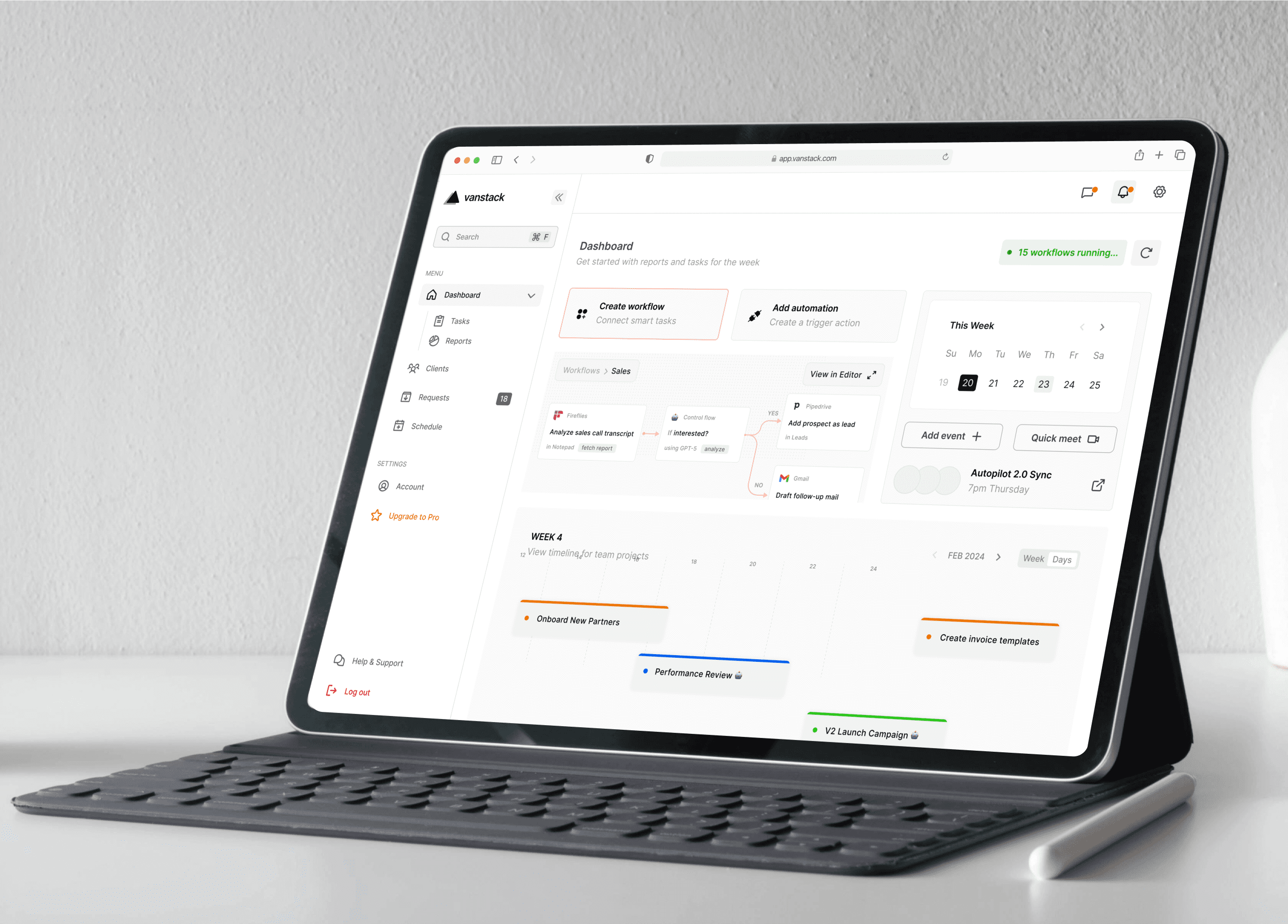
The usability of the dashboard and consisting views were evaluated often. With high fidelity comes great detail and key challenges in design choices. In order not to overwhelm the user, the question “does the user need this?” helped narrow elements down and reduce clutter. As seen here, data visualizations and activity were deemed excessive for this page and removed.
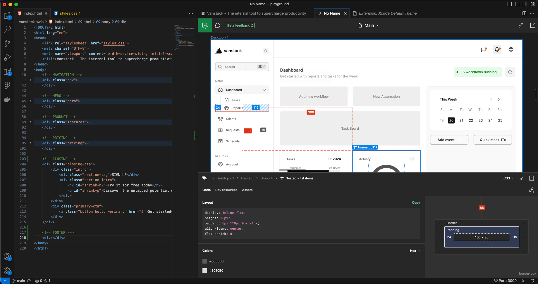
Moving into development, typefaces and other assets were fetched to build the webpage. Elements were structured to be keyboard-navigable and responsive. To ensure users are informed when the link is shared on social media, open graph and meta tags were used to provide details in a rich view. Visit the website here.
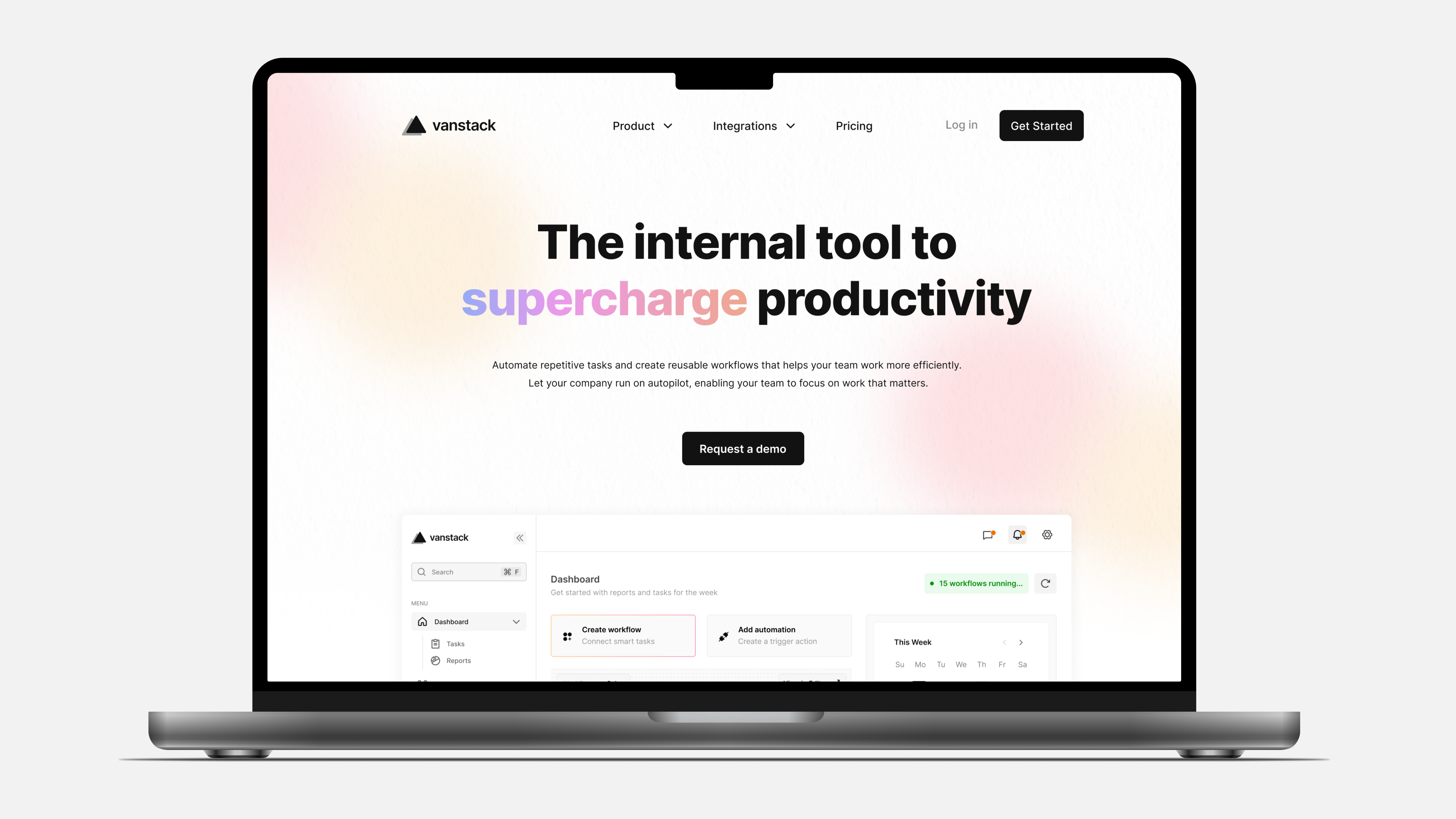
In less than a month, this personal project went from idea to a functional prototype. Automating tasks and integrating tools to help businesses run on autopilot.
The hero view captures the attention of visitors and clear engaging copy in subsequent sections keep them reading. By using reusable style variables, consistency as intended by design can be maintained. Text alternatives for non-text content such as images were also added to improve overall accessibility.
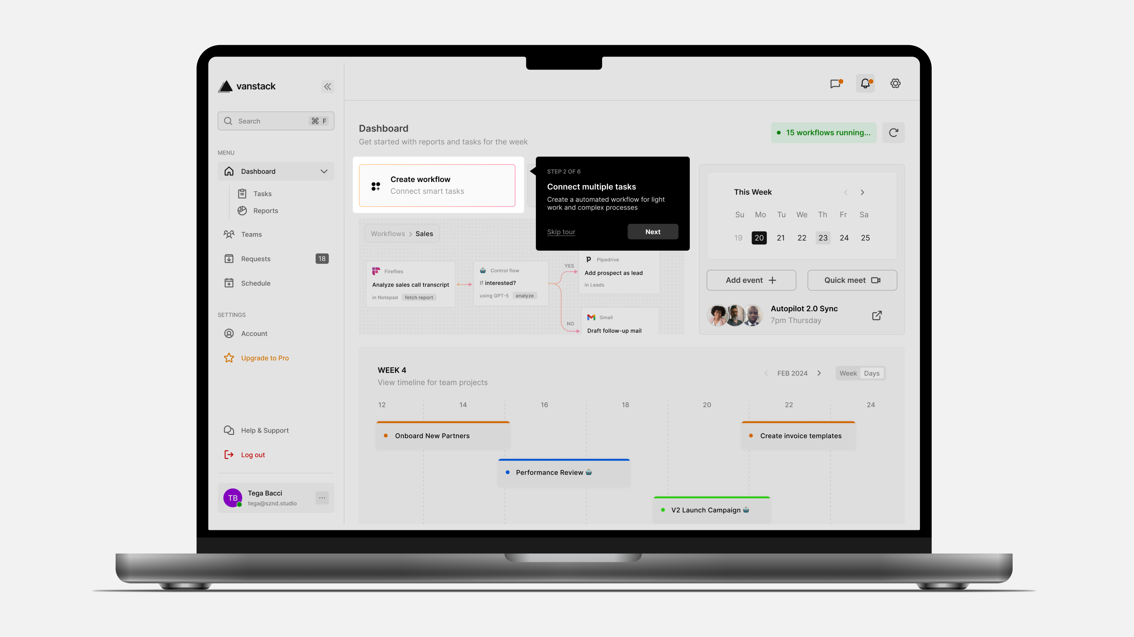
It takes a while for the average employee to use most tools effectively as the learning curve might be steep. To mitigate this, on-screen tutorials give first time users a walkthrough of the product. Pre-curated workflow templates were also considered to ensure teams can easily get started automating in a few minutes.
Teamwork is crucial to the success of a business so communication was enabled in the app. With integrations and messaging built in, team members can always stay in sync. Notifications were designed to be non-intrusive, keeping individuals informed on active automations, tasks assigned and requests.
It was a rewarding experience working on this, despite being a side project. It helped bring to light gaps to bridge between design and development, especially for web. A few areas I gained new understanding in are:
Visit the website here.