
Citisquare
This looks like what you need?
Overview
As people build wealth, they often invest in real estate or spend on travel and vacation experiences. Citisquare Africa operates at this intersection, offering premium property opportunities and curated vacation packages in high-demand cities like Lagos and Abuja. I was commissioned to redesign the landing page and improve the e-commerce experience to drive stronger engagement and increase conversions.
ROLE
Design Contractor
DURATION
4 weeks
WHAT I DID
- User Research
- Heuristic Evaluation
- Web Design
- Component Library
- Usability Testing
Leading showcase
The Problem
Citisquare already had a customer-facing website used to promote exclusive deals on real estate and vacation packages. However, conversion rate from visitors to new signups was as low as 6% and dropoff rates were high. SEO ranking also was a huge concern as the messaging lacked clarity and content did not align well with user intent, which affected discoverability and relevance.
“What are the root causes of user friction and low conversion?”
To understand why the current site performed poorly, I reviewed customer complaints and conducted interviews with a dozen uninformed users, alongside product owners. Feedback from two key stakeholders closely connected to customers were also included.
4
user interviews
6
live chat complaints
20
survey responses
2+
stakeholder feedback
Patterns quickly emerged. Users struggled with clarity, trust signals, and navigation. Many of the friction points were tied directly to experience gaps rather than the offerings themselves. These findings confirmed that a strong UX overhaul could significantly improve outcomes.
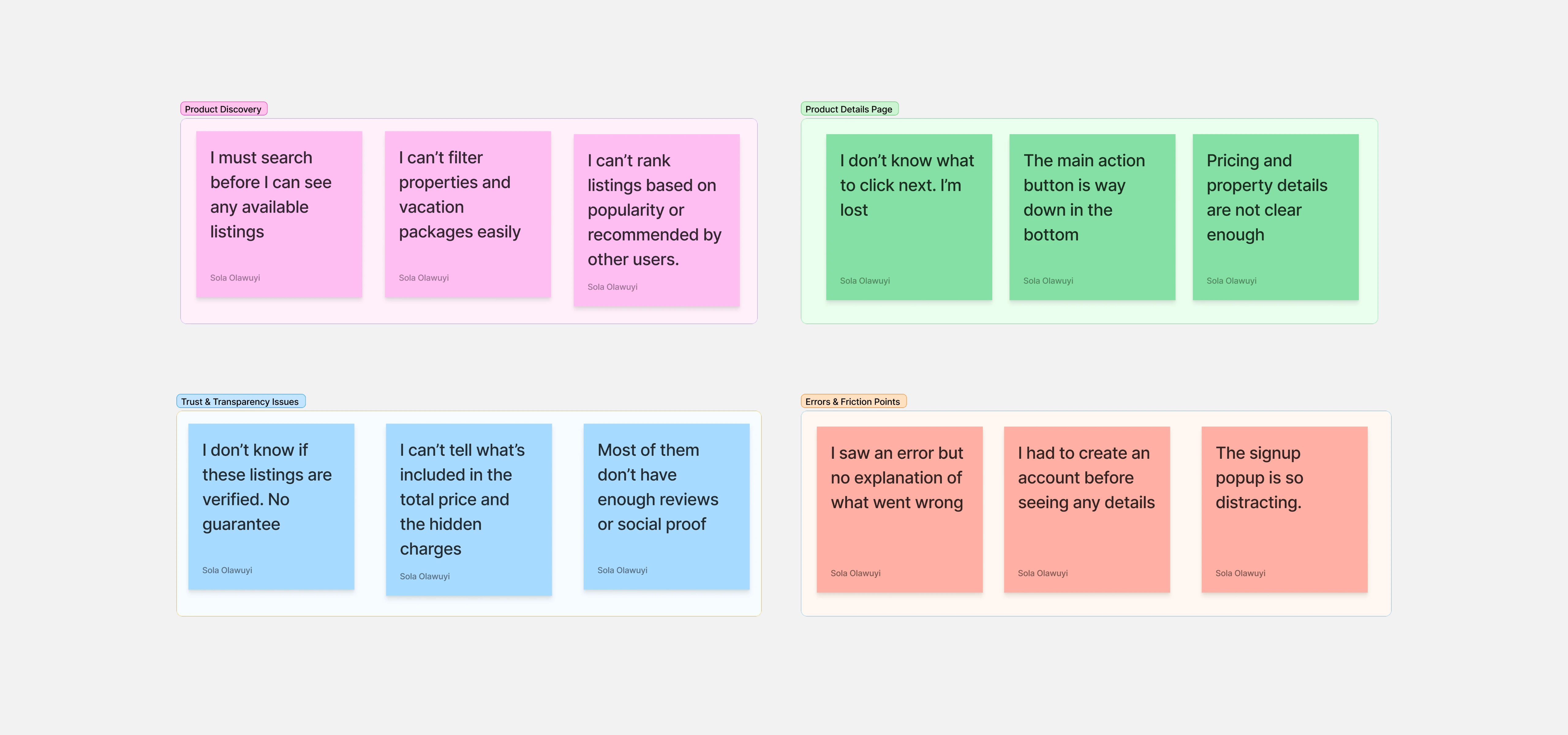
Feedback on stickies
Heuristic Evaluation
Going through the site myself, I was able to identify some loose ends and multiple usability issues that could impact user satisfaction. These ranged from unclear calls-to-action and inconsistent navigation to weak error handling and visual inconsistencies.
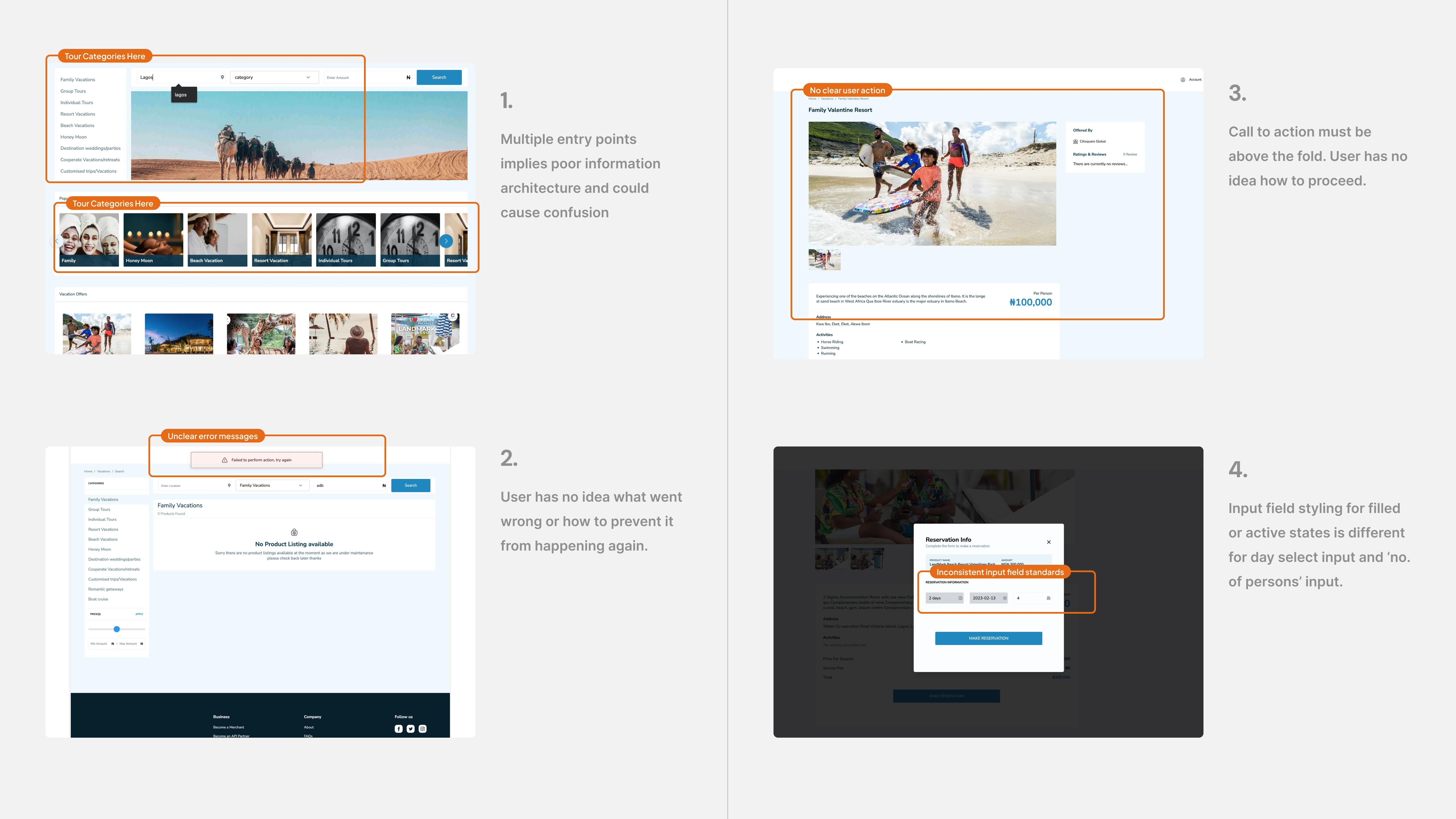
Design Audit Findings
To strengthen the case, I mapped these findings against Jakob Nielsen’s usability heuristics. This helped connect user frustrations to recognized usability principles and demonstrated how these gaps directly impacted conversions. Presenting this structured analysis created alignment with stakeholders and clarified the path forward.
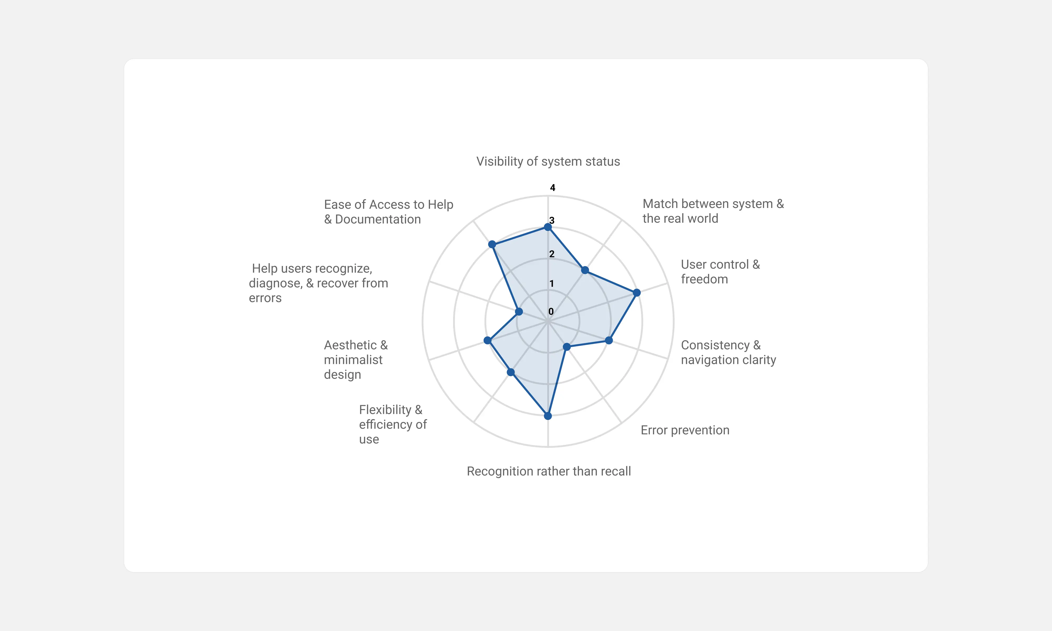
Usability Heuristics Graph
Persona
To stay grounded needs of in real users, I developed a persona based on our ideal customer profile. This included their motivations, frustrations, expectations, and goals; be it searching for investment property or planning a vacation. This framework ensured that every design decision supported user intent and improved overall satisfaction.
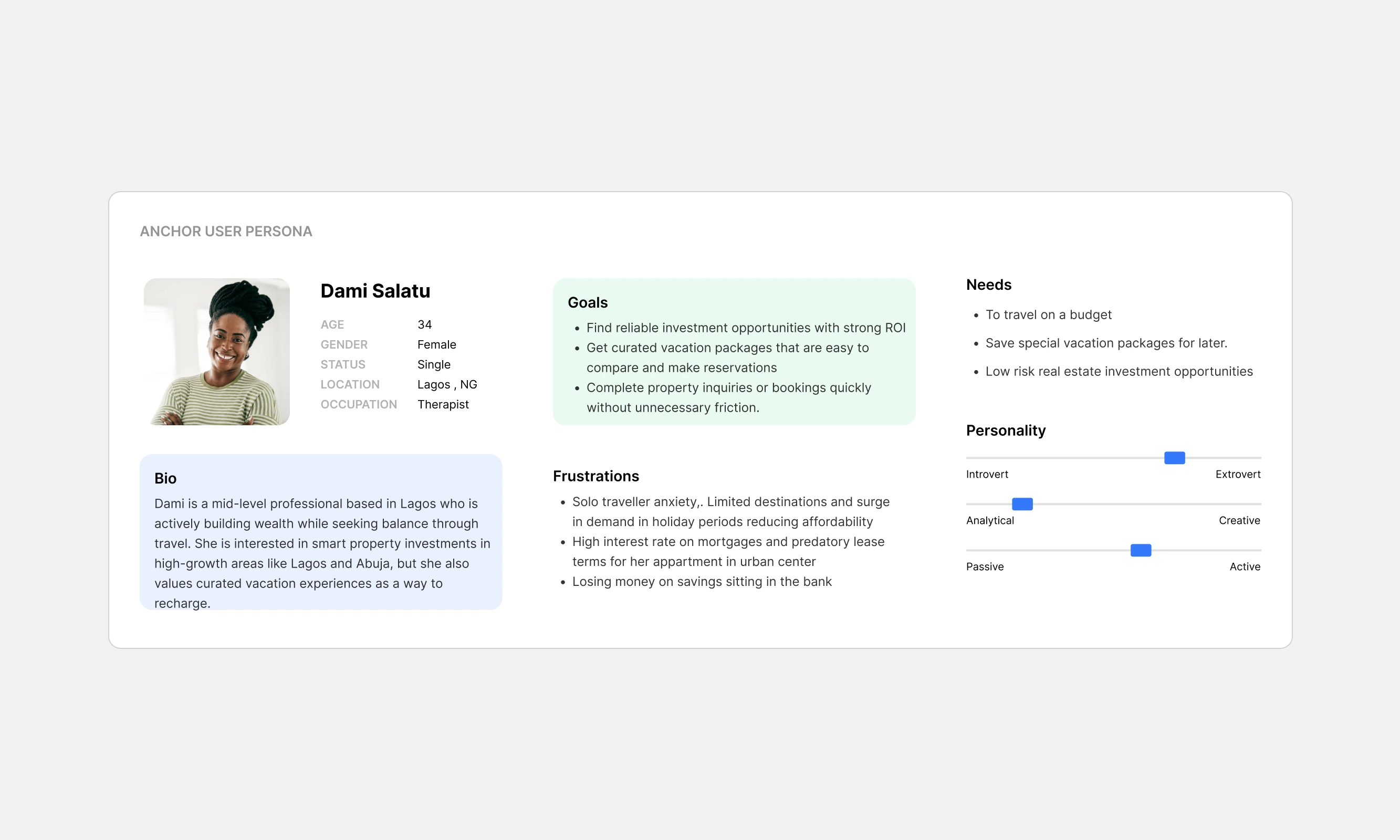
User Persona
The existing information architecture was largely functional, so I focused on improving the shopping flow and redesigning the landing experience. Stakeholders preferred to retain the current hero section style, so I redesigned components using the existing design tokens while refining interactions to include hover, active, and error states. I built a structured component library to ensure consistency and scalable design implementation.
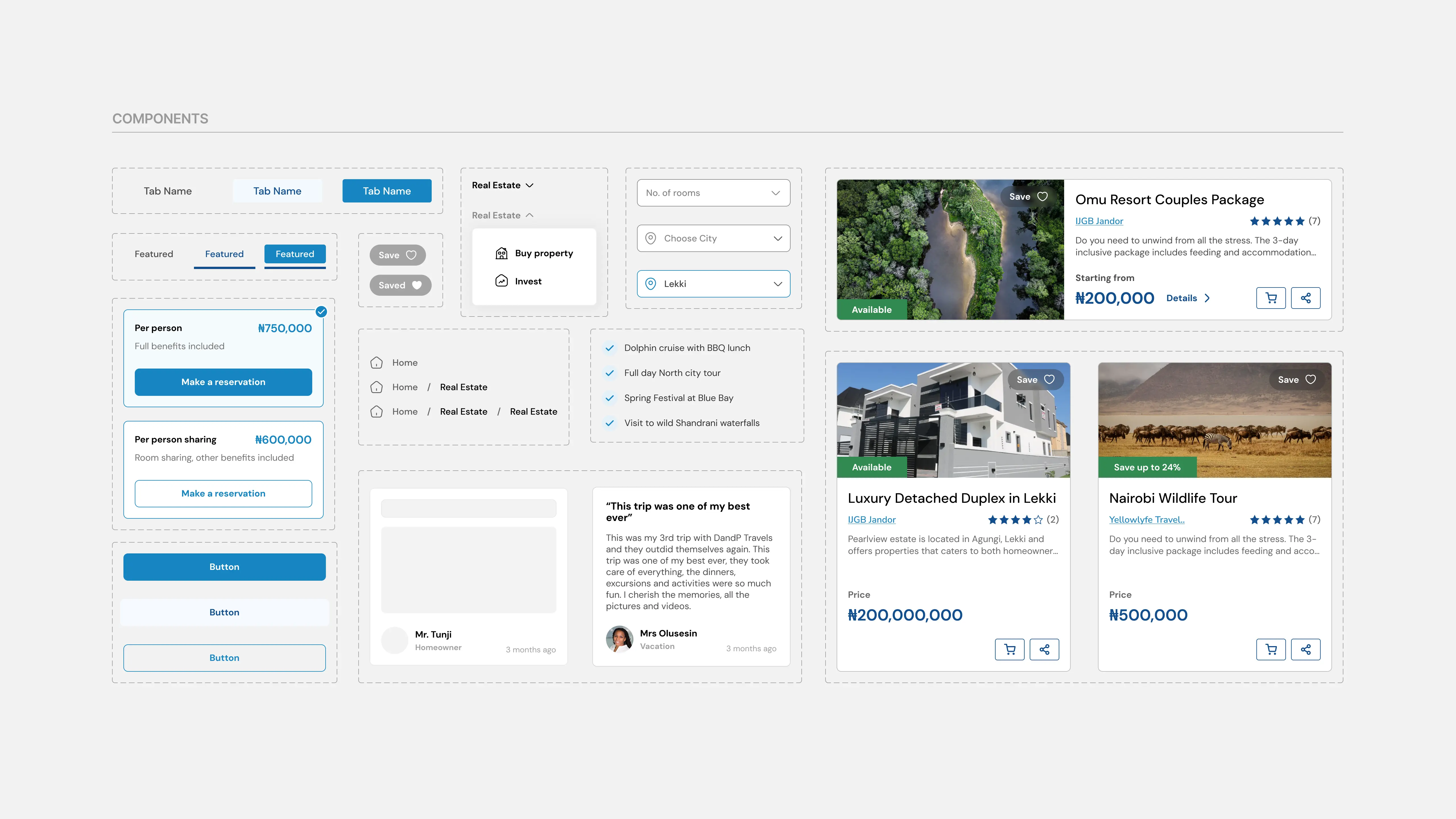
Component Design
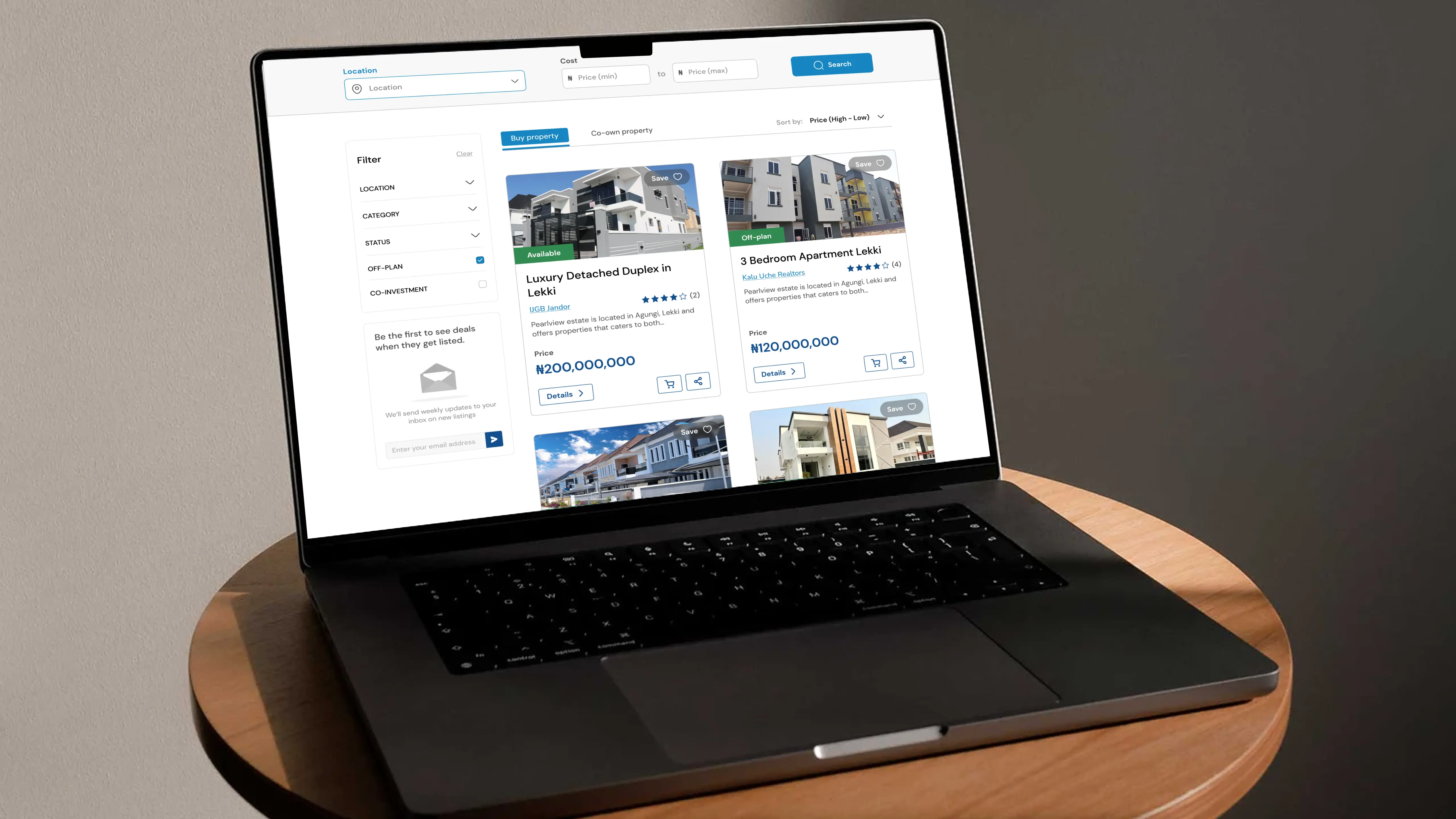
Landing Page
The landing page serves as the storefront and first impression. It needed to communicate value instantly and guide visitors clearly toward action. I restructured sections to ensure each block had a clear purpose. Subtle motion and refined interactions were introduced to enhance clarity without distraction. After multiple iterations, the final layout improved hierarchy, storytelling, and user flow.
Product Details Page
Each property or vacation package needed a focused, persuasive experience. The previous product page lacked obvious action cues and clear hierarchy. I redesigned the product page using a familiar e-commerce pattern, placing primary calls-to-action prominently on the right to align with common mental models. Within the first week of launch, this page recorded a 67% engagement rate. I also provided post-launch guidelines covering image quality, resolution standards, and content structure to maintain consistency.
Usability Testing
Using Maze and Microsoft Clarity, I ran A/B tests on the account-creation splash modal. I conducted unmoderated testing with session recordings and tested three variations across different user groups. The results revealed a clear preference for discount-driven messaging. These insights informed the final implementation and strengthened conversion performance.
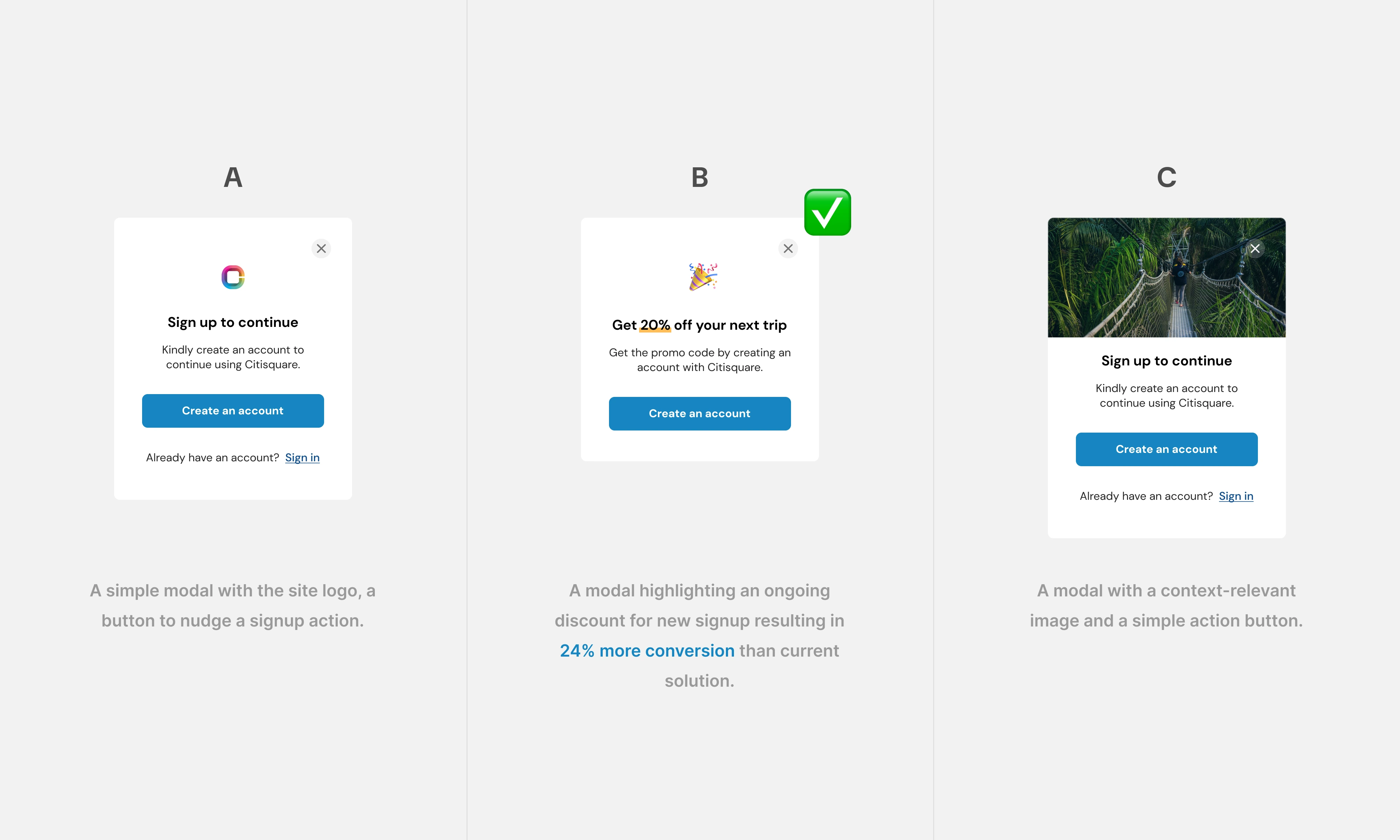
A/B Testing for Conversion
Development Handoff
After handoff, I conducted a design audit during development and identified several inconsistencies in implementation, particularly with mobile responsiveness. Issues ranged from card layouts and image sizing to overflow handling and spacing inconsistencies. I worked closely with the engineer, adding annotations and detailed specifications within the design file to ensure accurate, pixel-precise execution.
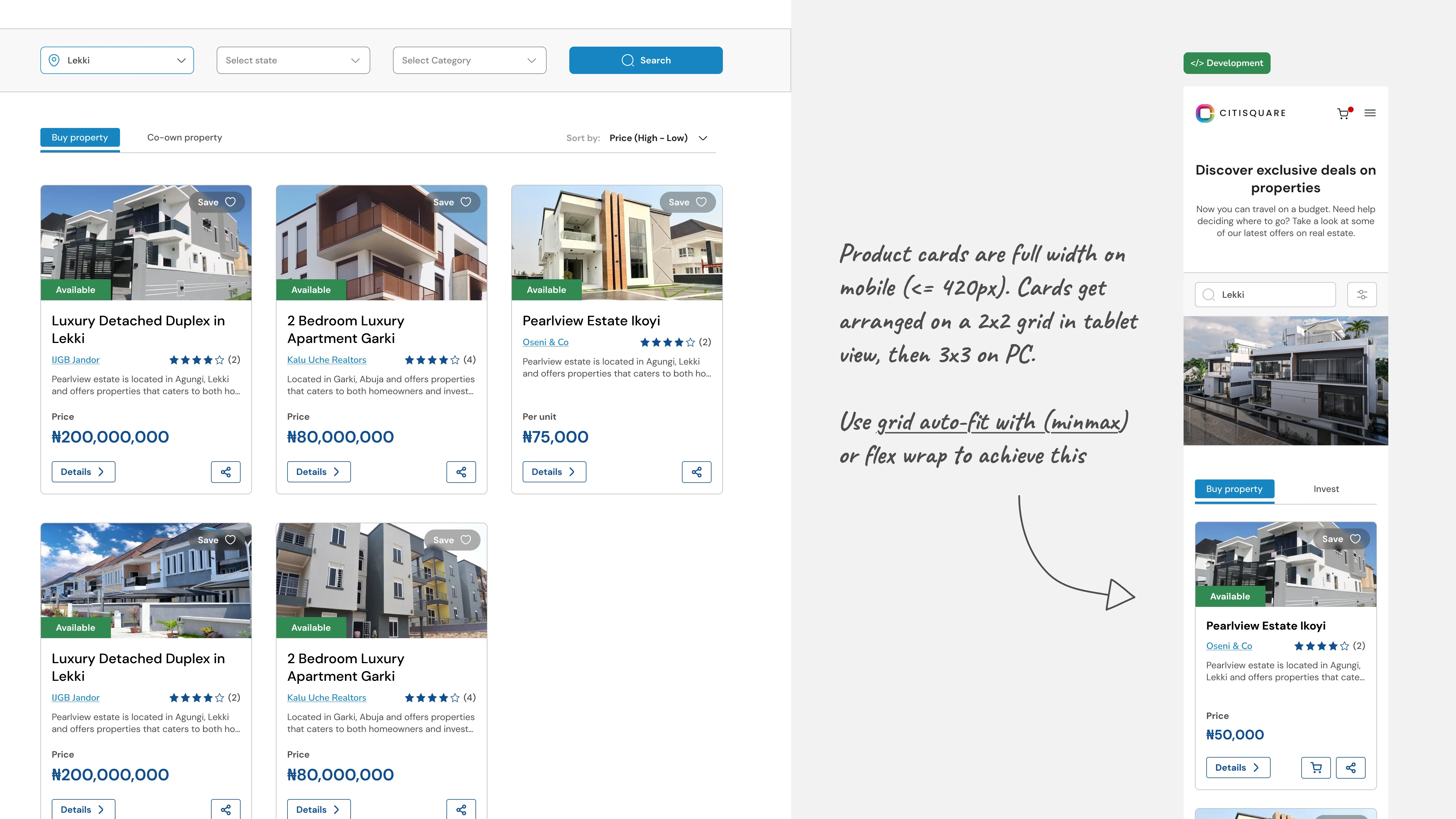
Annotated Handoff
Result and Impact
Within 2 weeks of launching the site redesign, the impact on our customers was evident with better engagement rates and backlinks from popular social media apps due to increase usage of quick link sharing. The site ranked top in name search and first page in related search for SEO showing clear alignment between content and user intent.
78%
engagement rate
90%
scroll depth
>2mins
avg. time spent
66.7%
organic social
Key Takeaways
Although this was a short engagement, it reinforced several important lessons:
- Applying Usability PrinciplesEvaluating design decisions and measuring against golden standard to visualize and better understand the impact of poor usability on site performance.
- Stakeholder CollaborationCollaboration with in-house teams in a way that carries everyone along, considering the product history, finding common ground and ensuring product is maintained as intended.
- Creating Lasting ImpactContributing to a company's design culture in a scalable way despite shorter engagement periods. Ensuring adoption of better practices for better designs.