
Atrium
This looks like what you need?
Overview
Six months into my time at Reframe, we decided to pursue a new product direction. Most users were leveraging the product for market research, so we pivoted to build a solution powered by agentic search and entity recognition systems. My role involved iterating on the product to better serve customer needs and building stronger brand connections to attract partners and improve loyalty.
ROLE
Design Engineer <br/> (Employee #5)
DURATION
Full time (11 tech years)
What I Did
- User Experience Design
- Usability Testing
- Frontend Implementation
- Branding
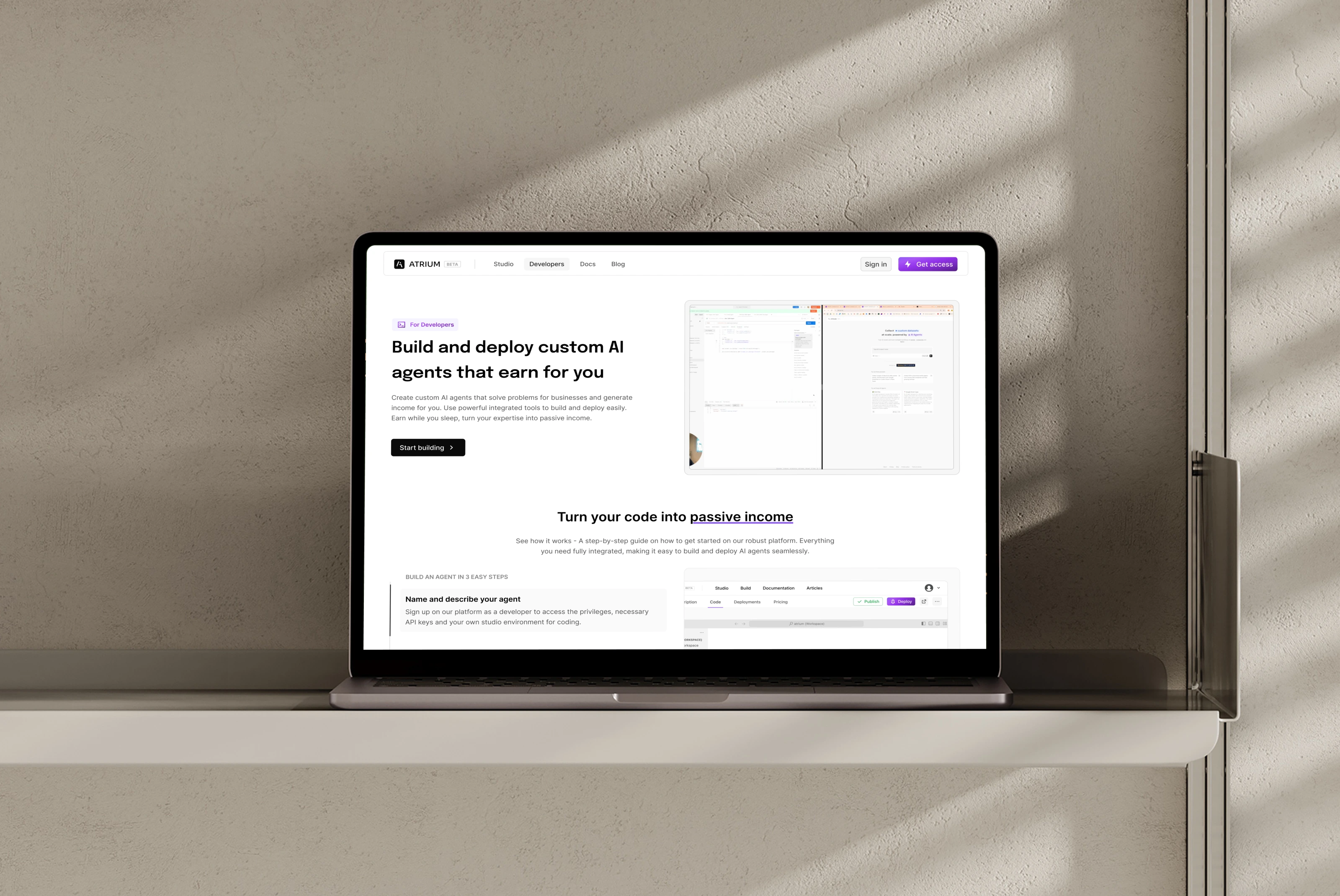
Developer Landing Page
The Background
For our main product Reframe AI, we had already developed and launched a product suite that helped top teams at Empowerly and JLL streamline data research with agentic AI workflows. We integrated AI agents into dataframes within a spreadsheet-like interface, allowing customers to automate data enrichment and qualification. "A spreadsheet that fills itself" - a competitors tagline
Beyond this, we also built a system that let clients sync their data realtime into a dataframe and run automated workflows to refine it. Reframe AI Forms, seamlessly integrated with customer stack and existing tools, feeding form submissions directly into dataframes to trigger advanced workflows. Collectively, we managed to take this feature from prototype to production in just three weeks; faster than teams at Notion Forms and Asana Forms.
The Problem
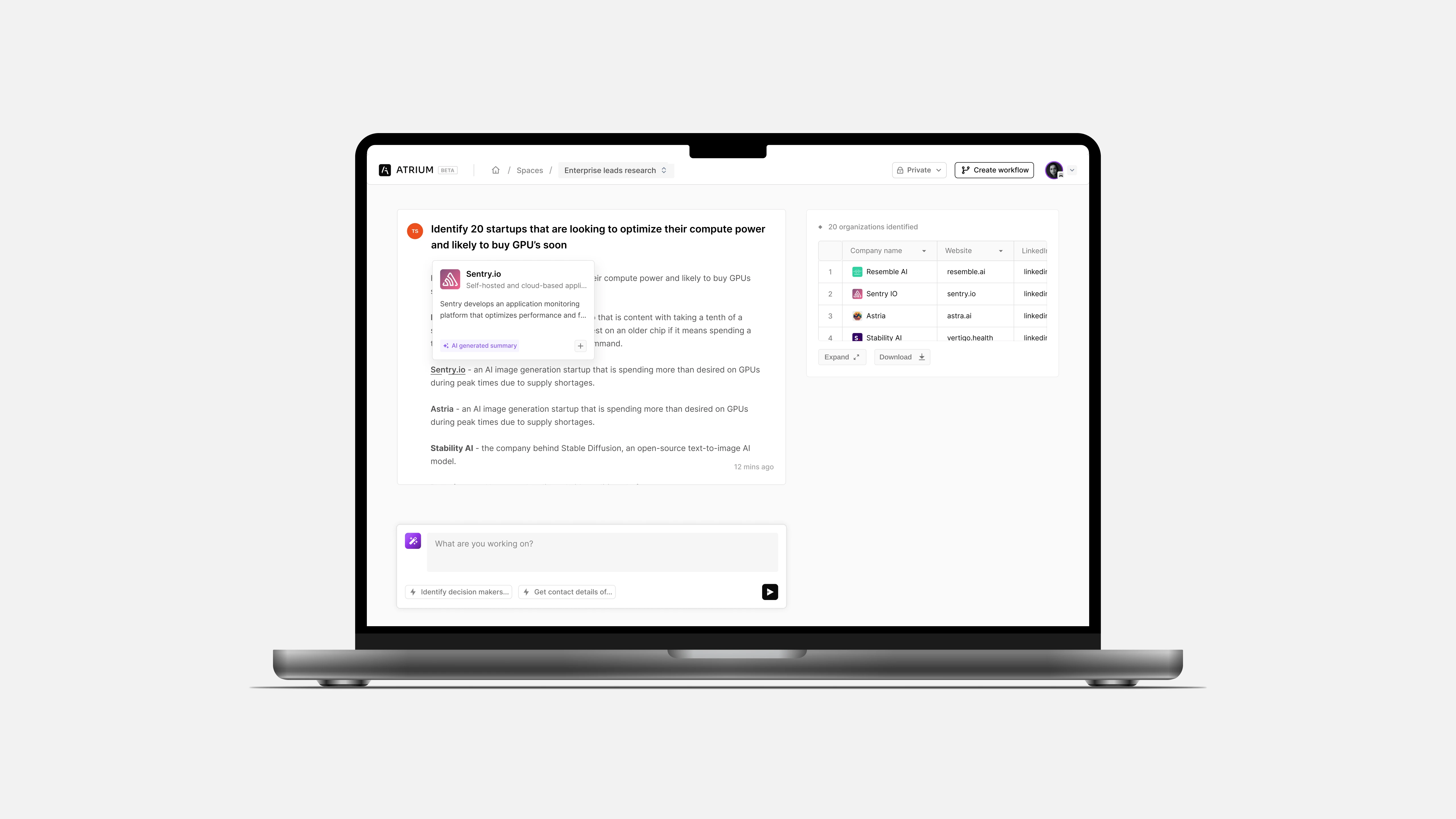
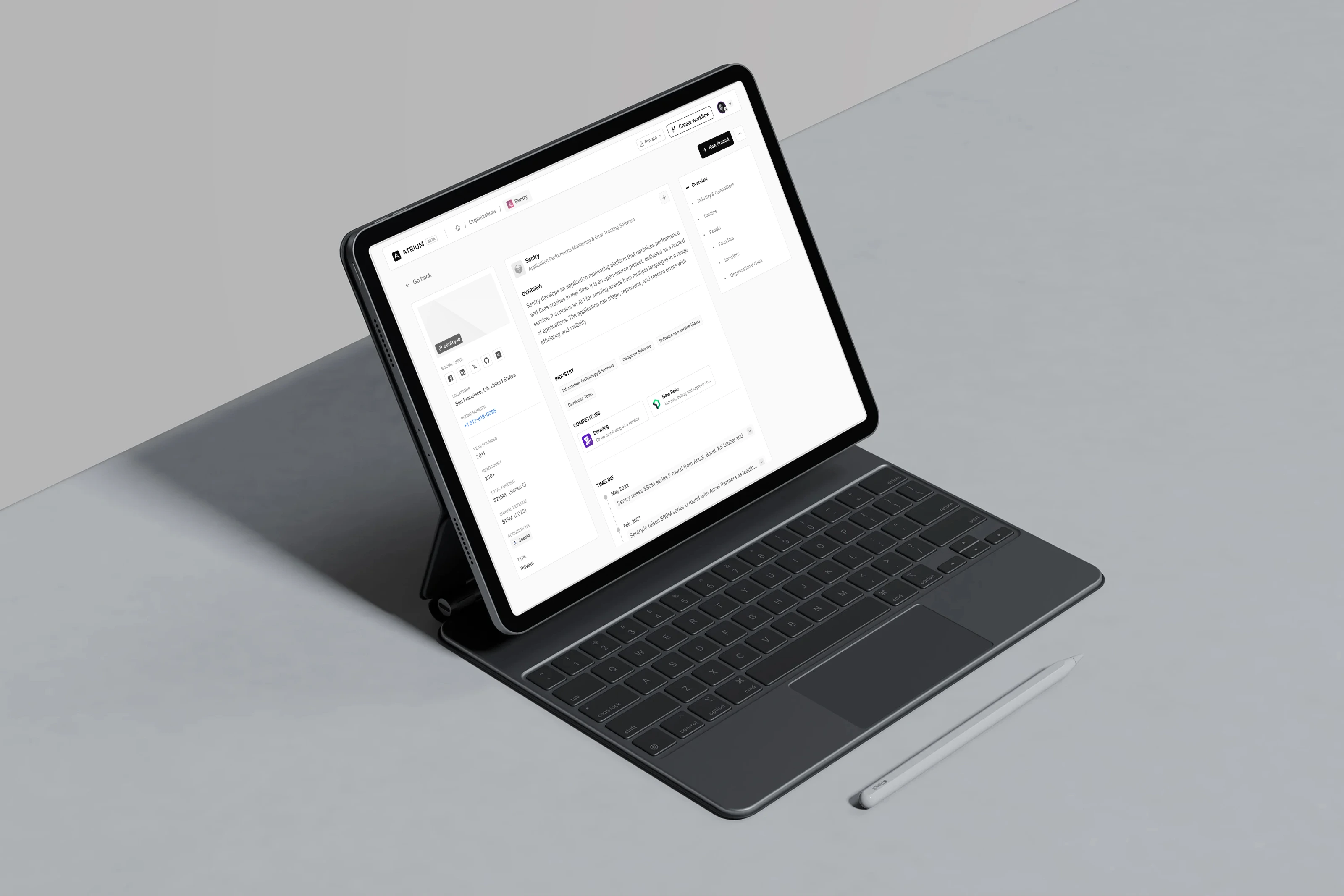
Over time, our research revealed that most teams used the product to gather intelligence on people and companies. When working with large dataframes (10k+ records) for instance, users often needed to dive deeper into a subset of high-value leads or entities. However, we did not provide a siloed environment or dedicated space for that, leaving users to export data elsewhere. Given that data has gravity, users tend to stick to the platform that meets most of their needs, so we were losing customers because we were restricting them.
hkja
Another key issue that became glaring was that, new users struggled to immediately see value in the platform, and research workflows were not fully optimized even for advanced users. We needed a better way to support customers and enhance their experience. Therefore we decided to rethink our strategy and how we meet our customers growing needs, starting with our primary problem statement.
"How can we make it easier and seamless for teams to quickly research hundreds of data points on people and companies in a few clicks?"
Gauging Customer Interest
To ensure we were going in the right direction, we identified and segmented key customer factions based on how they engaged with the product. This helped us pinpoint opportunities, competitive gaps, and areas for quick wins. We prioritized users whose problems closely aligned with our solution, ensuring that the product’s value would be immediately clear - the Aha! moment; upon using it.
- Sales TeamsNeed to improve efficiency of sales pipeline and qualifying leads
- Founders & InvestorsTo improve decision making and get rich data on prospective partners or hires
- Researchers & AnalystsTo carry out days worth of research and data enrichment in less than a minute
Market Research - Competitors?
Analyzing the competitive landscape, we identified several companies offering similar data solutions. Instead of competing directly, we focused on differentiating our product by offering best-in-class innovative features designed for data-heavy teams.
Integrating User Scenarios
In an effort to stay true to the customers painpoints throughout the process, we used real-world scenarios and test cases as guiding anchors. This frmework helped sharpen and influence our decision making, putting users front and center by design. This also helped shape the product by catering to the evolving needs of active customers while also considering potential teams we could pitch to.
Ideating v1
With a clear vision of what we wanted to build, we focused on aligning the product interactions and identifying areas for improvement. This meant redesigning most components and pages from scratch. To move quickly, we started from the basics. I used sketches as low stakes prototype to explore layout ideas of the onboarding and core app module.
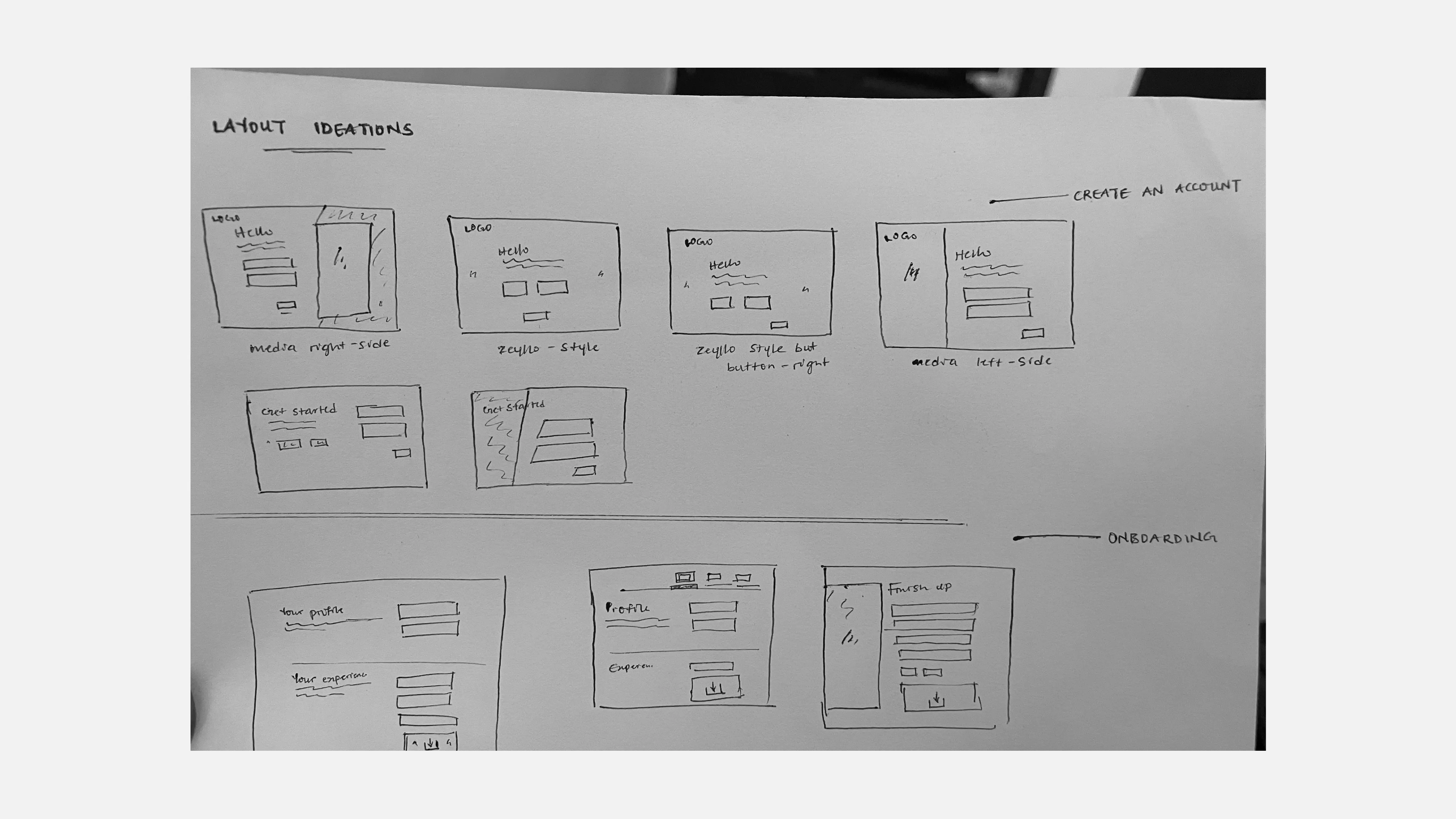
Layout Ideations - Onboarding
Applying Atomic Design Principles
Our internal design system, Jenga (Unnamed), aligned with existing components in the codebase for efficiency. Using atomic design as a mental model, we broke down pages into a collection of smaller, reusable components. A system of functioning parts working together. This helped us structure everything from foundational styles like color and typography to complex UI elements like the prompt box.
Design System Components
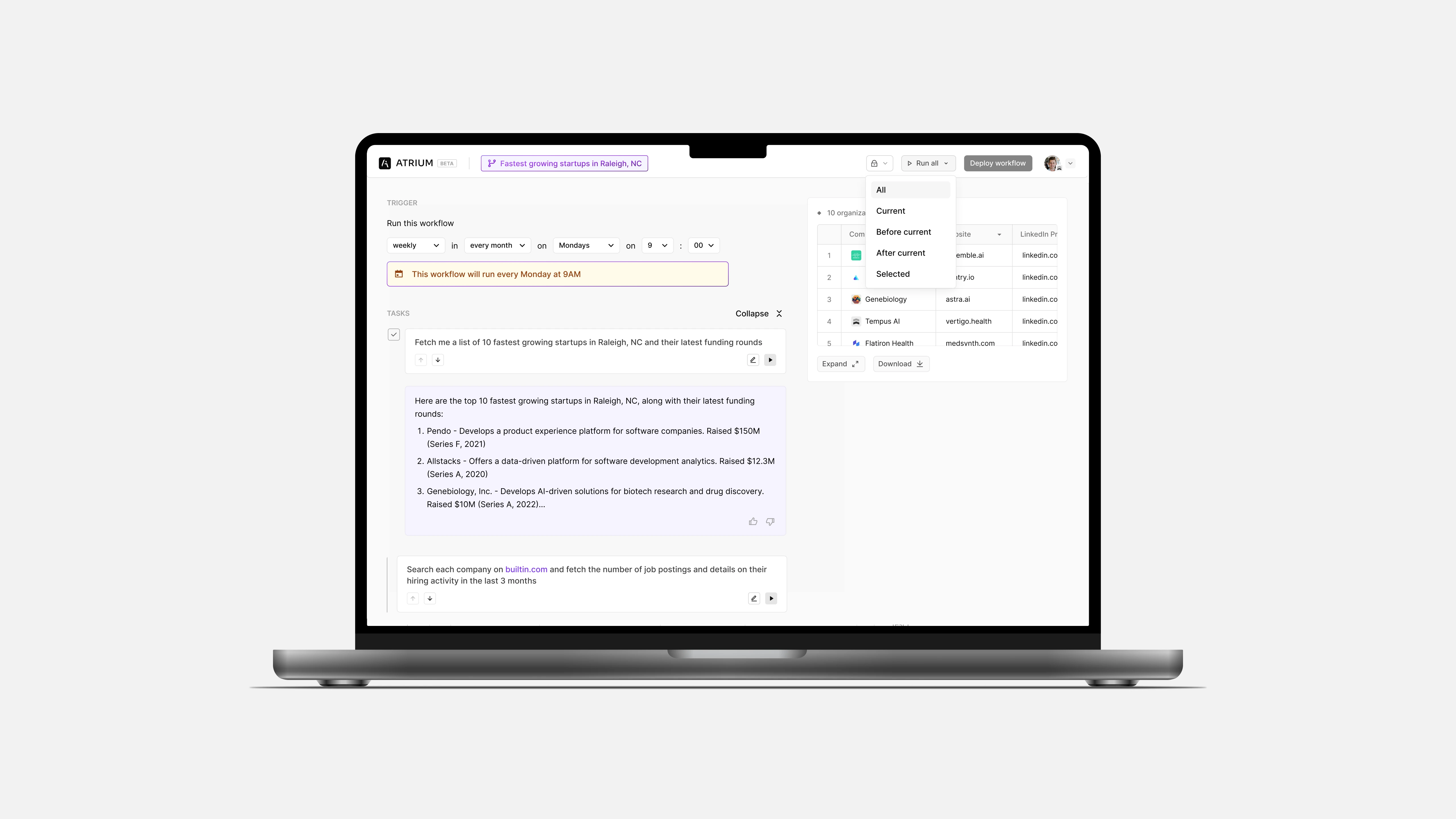
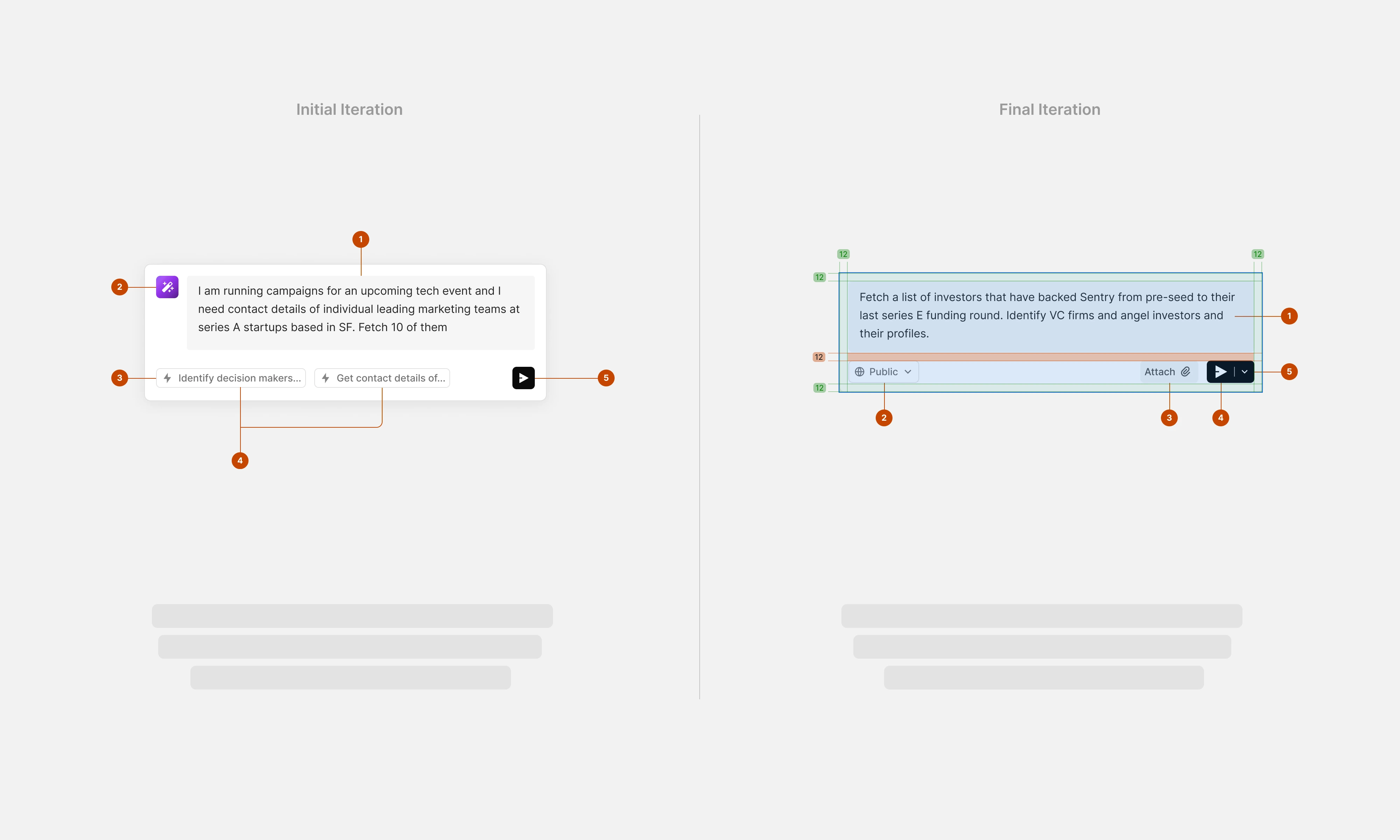
Iteration: Prompt Box
The prompt box is where users interact with AI agents, so we aimed to make it as intuitive as possible. As a relatively new concept in interaction design, we learned through trial and error. The initial version featured minimal elements, including a panel for quick suggestions. Over time, we refined it by adding an attach button, markdown formatting and a visibility selector to improve usability.
Prompt Box Iterations
Usability Testing
With Maze, we conducted usability testing sessions over a two-week period, uncovering insights, identified pain points and which improvements to prioritize - quick wins or potential gems.
12
total participants
74%
success rate
12s
avg duration
32.7%
misclick rate
Balancing customer and business goals
As seen in the video below, users were allowed to interact with the prompt box and understand how best to engineer prompts. But initially, users had to sign up before seeing any prompt results, creating friction. To address this, I redesigned the landing page to include predefined “try out” prompts that displayed results without requiring sign-up. This approach allowed users to experience the product before committing, leading to higher conversions at no extra cost to the business.
Canvas → Frontend
As design engineer, my role involved translating designs into functional code. I would share high-fidelity prototypes for feedback, then move on to implement updates using React, Next.js, Tailwind, GraphQL, and SCSS. With our robust library of utility and animation classes, I could efficiently write JSX code and create pull requests. For each PR, there would be automated checks of performance, acessibility, dark mode, and QA benchmarks then it would be reviewed by two teammates before merging into staging for internal testing and demo calls.
Expanding the Ecosystem
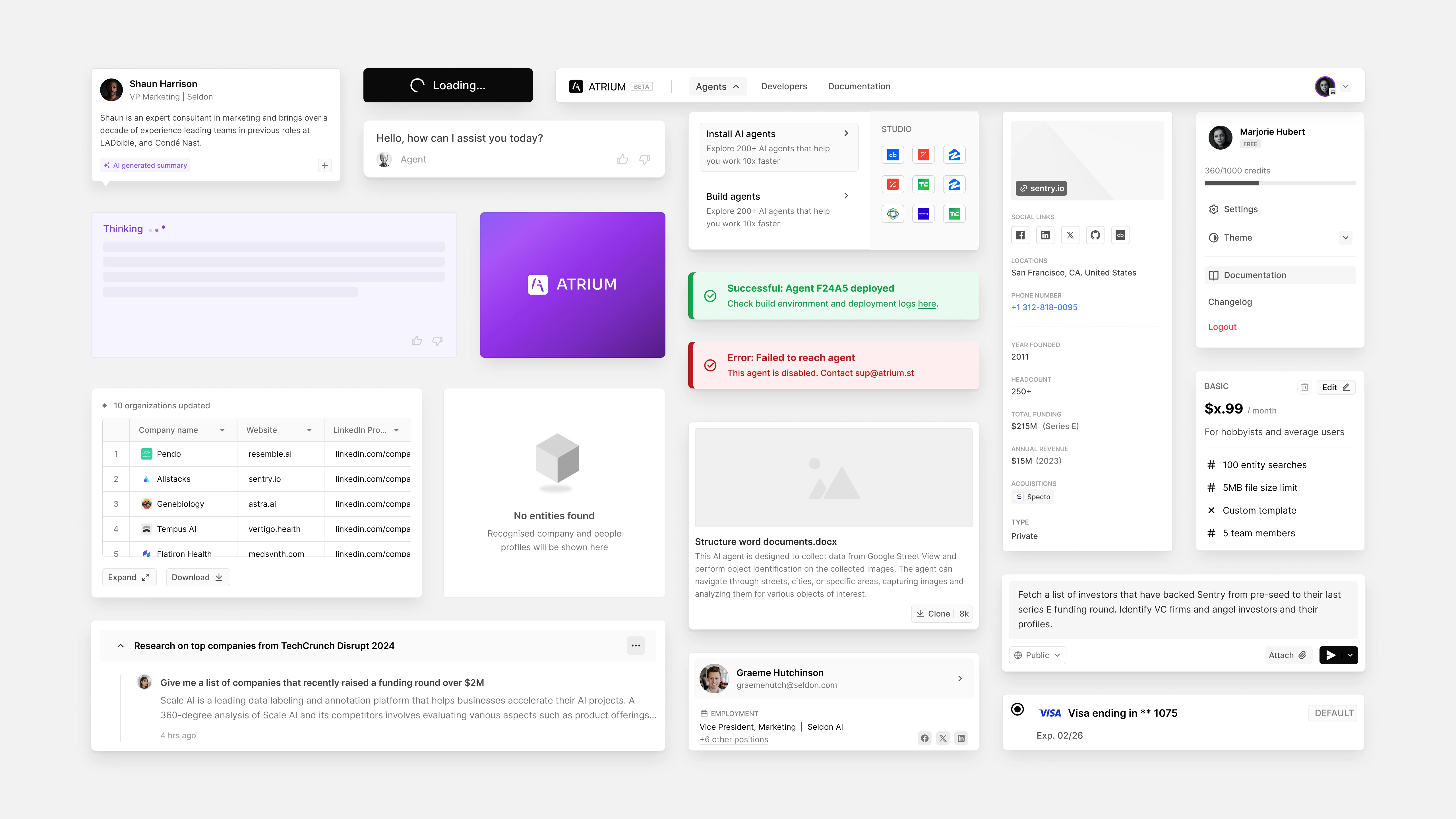
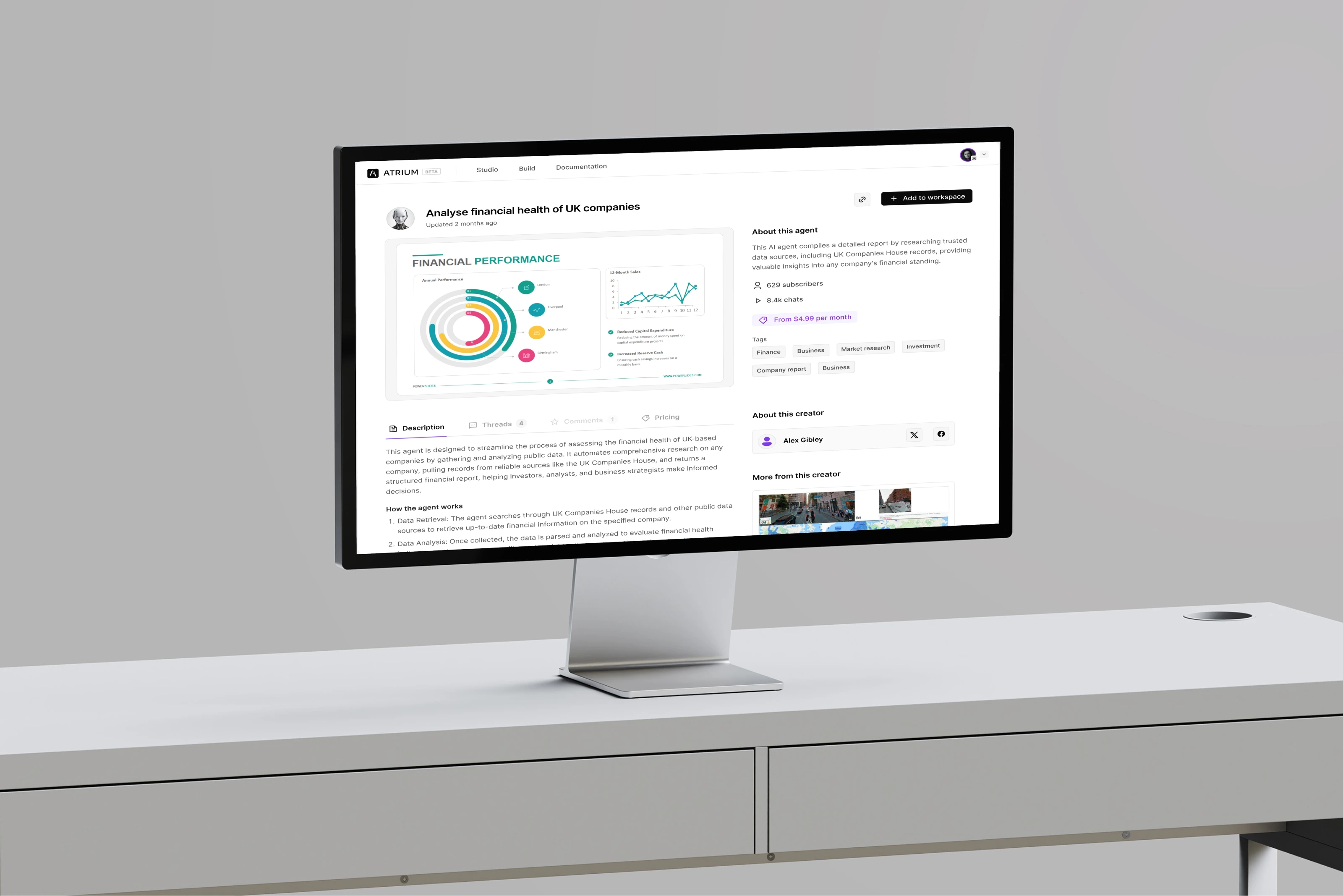
With insights from users, we built Reframe V2, a platform offering an AI agent ecosystem tailored to enterprise needs. This included tools for developers to create, deploy, and monetize AI agents, providing new revenue streams.
bbx
Navigation Enhancements
The updated platform introduced seamless two-level navigation for better user experience, making it easier for users to explore and deploy agents.
V2 Navigation
The updated platform introduced seamless two-level navigation for better user experience, making it easier for users to explore and deploy agents.
V2 Navigation
Key Takeaways
This project reinforced the importance of user research and iterative design. While we successfully delivered a robust solution, areas like documentation needed more attention. Balancing rapid delivery with thorough planning remains a critical lesson.